


∴Shooting for Print∴
Four great tips and one you don't want to hear

For anyone who’s spent some time with me here on Substack, or over at YouTube, you’ll know I advocate for printing photos. Especially printing them small.
But despite my love for it, not all photos look great printed. Sometimes they just fall a bit flat on the page. And sometimes, things just don’t turn out how you expected they would once they’re committed to paper.
But if you keep a few simple things in mind and know your intended outcome, I believe you’ll find it that much easier to shoot with the intentionality that really makes the pages of your print project sing. I’ve composed all these thoughts together for you in my latest video, which starts with some print metafiction and ends Lord knows where so if you’re here and reading this, I think you’ll be into it.
For the readers, don’t fret! Here follows the pen and paper version. So how do you photograph with printing in mind?
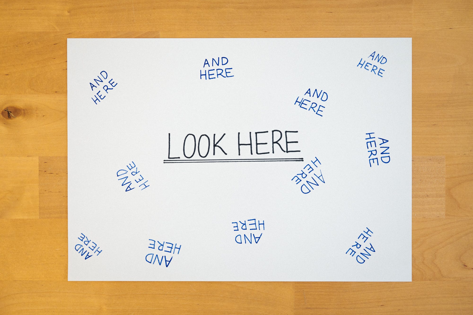
Careful of your edges
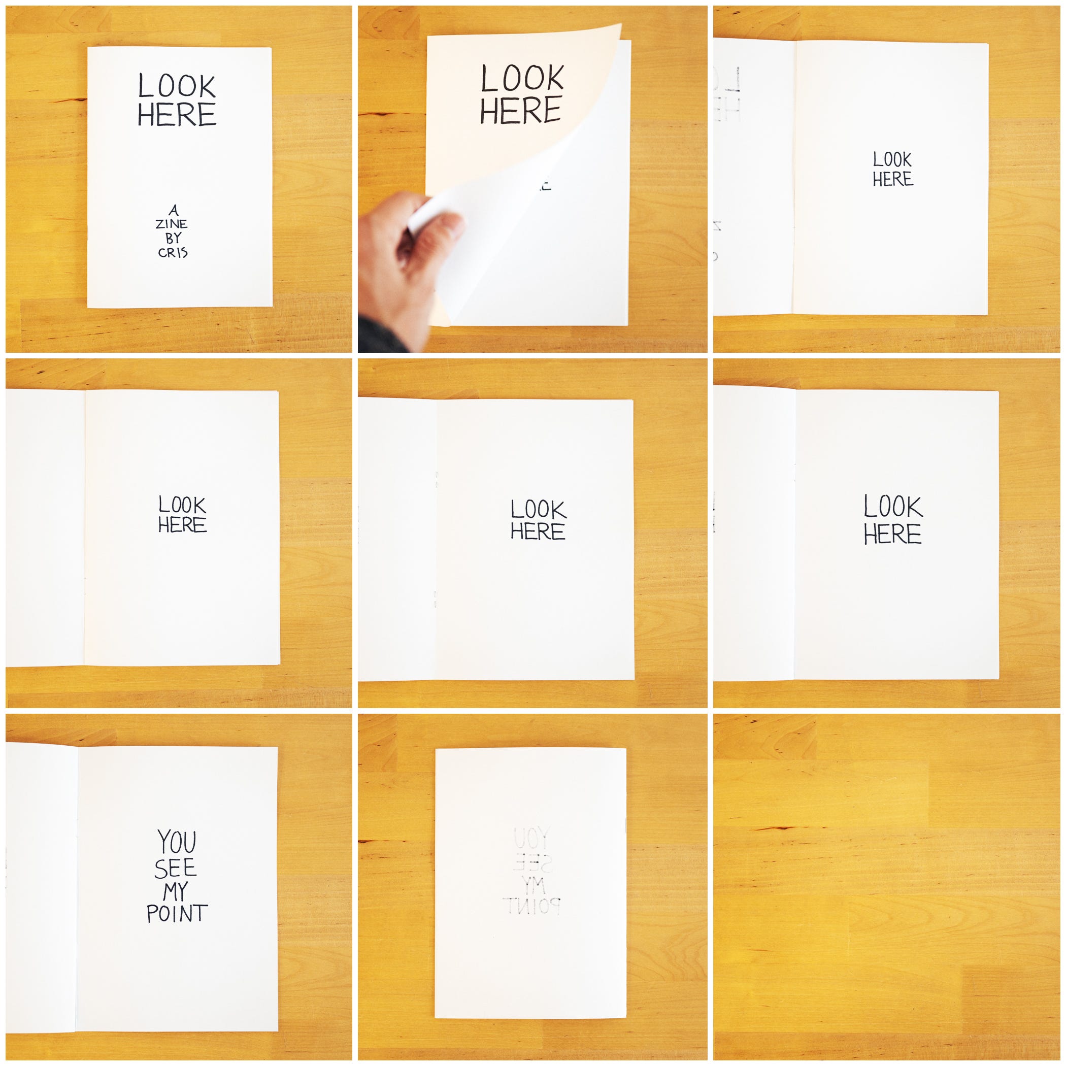
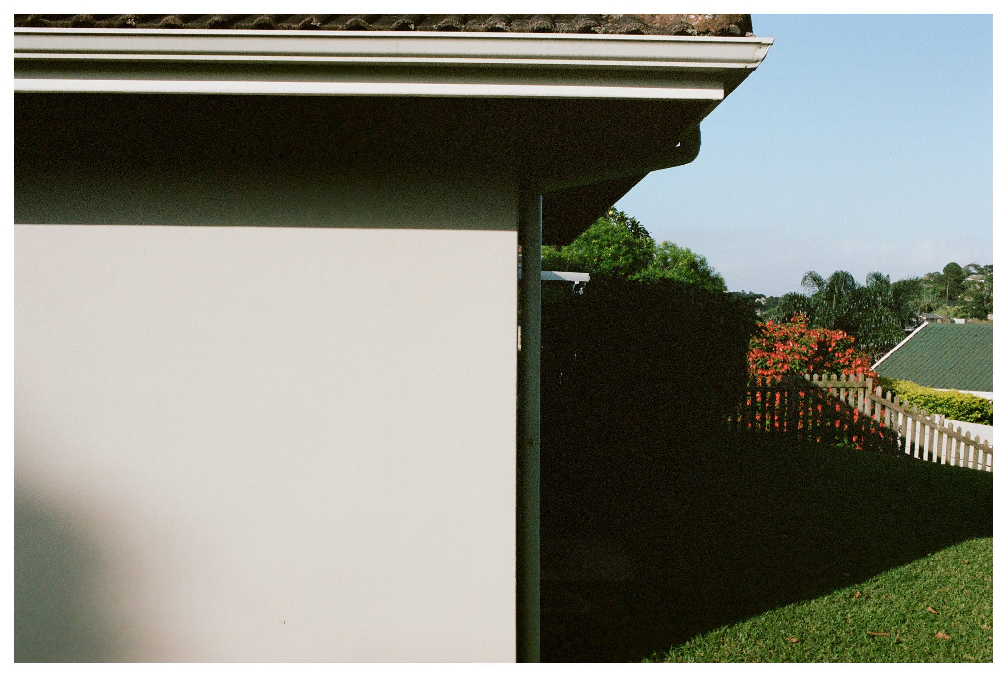
The first tip is purely a practical one - be considerate of your photos’ edges because the edge might not make it onto the page at all. The most common example of this is if you print full bleed, which means right to the edge of the page.
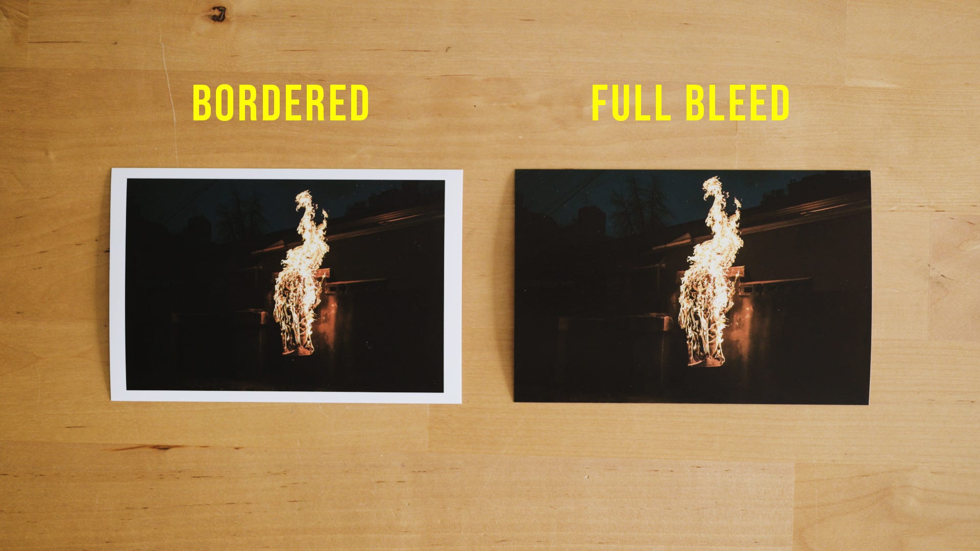
In order to achieve full bleed, you’ll either overprint, which means printing off the paper’s edge, or print with a border and then just cut it off. If you know your photo project will include full bleed spreads you might want to leave a little breathing room around your subject when photographing it. If you don’t, you might not be able to fit on the page as much of the image as you expect.
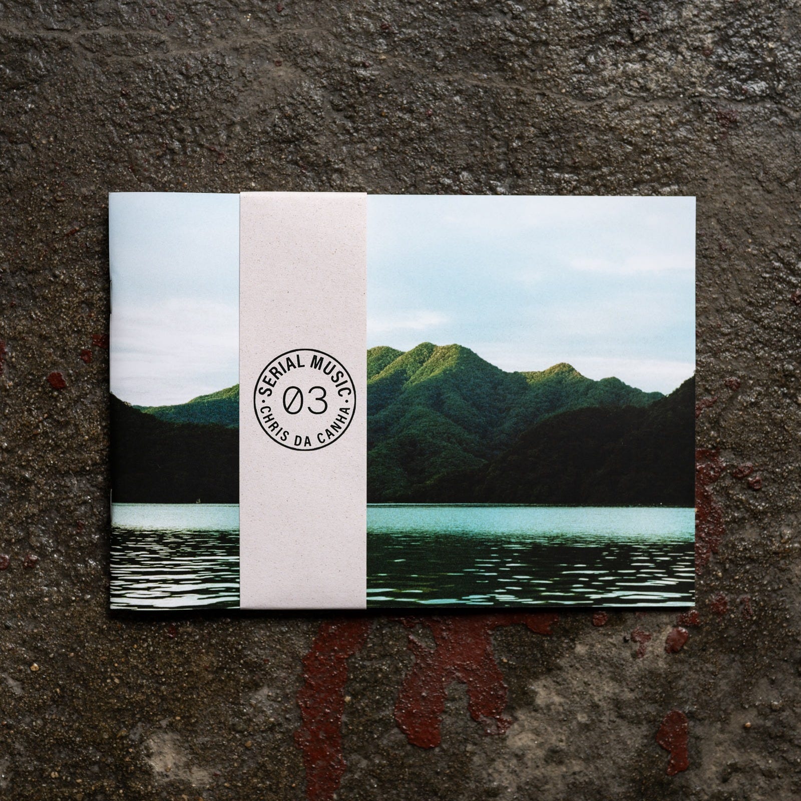
I like to place elements right up against the side of the frame, so when I started working on my project Serial Music, I knew ahead of time I’d be using a border instead of going full bleed.
Knowing this meant that I could use the entire frame without any worry and that I didn’t feel like any part of my images was being lost to a lack of planning.
Move Your Subject Around the Frame
Something that became clear to me when I started making zines out of my photos was just how often I put my subject at the center of the frame.
This might have to do with me getting my first camera and Instagram launching in the same year, but, who knows? I have no problem with a centered subject, but once you start thinking about how to sequence your photos into the pages of a book or zine, there can be something very repetitive about the subject always being in roughly the same place on the page.
Instead, I try to keep the reader’s eye moving on every page. You can do this by placing your subject in different parts of the frame, encouraging the reader’s eye to move in order to follow it.
This act of searching your reader is doing, and their uncertainty about where their eyes will go on the next page keeps them engaged and paying just that much more attention to your photographs.


Test it for yourself - grab your favorite photo book and try get a sense of how your eyes move from one image to the next.
Move Your Reader Through the Frame
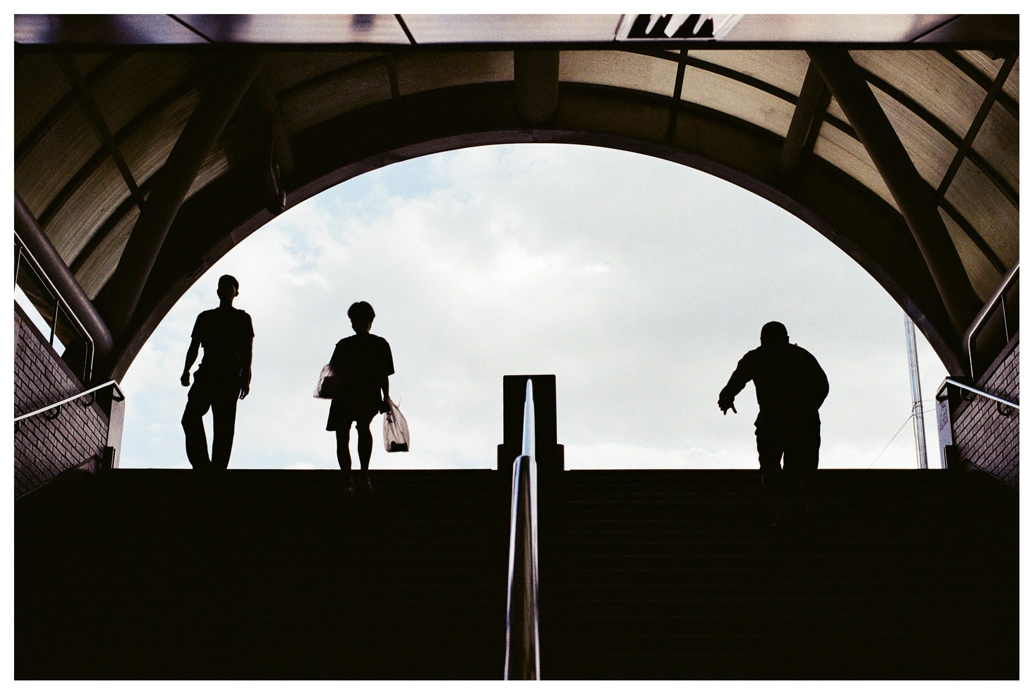
Sequencing aside, it’s worthwhile to think about what singular images look great printed. In my opinion, photos where your eye moves through the image, from one part of it to another, work really well in print. Again, they keep the reader’s eye moving, and encourage a deeper look at the image.
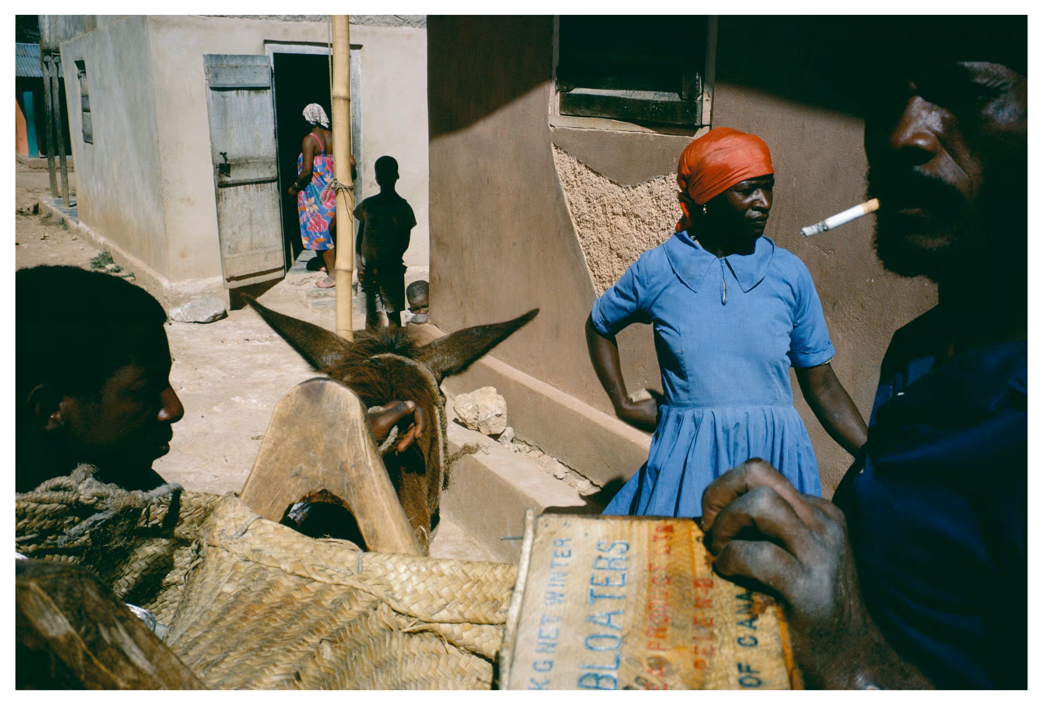
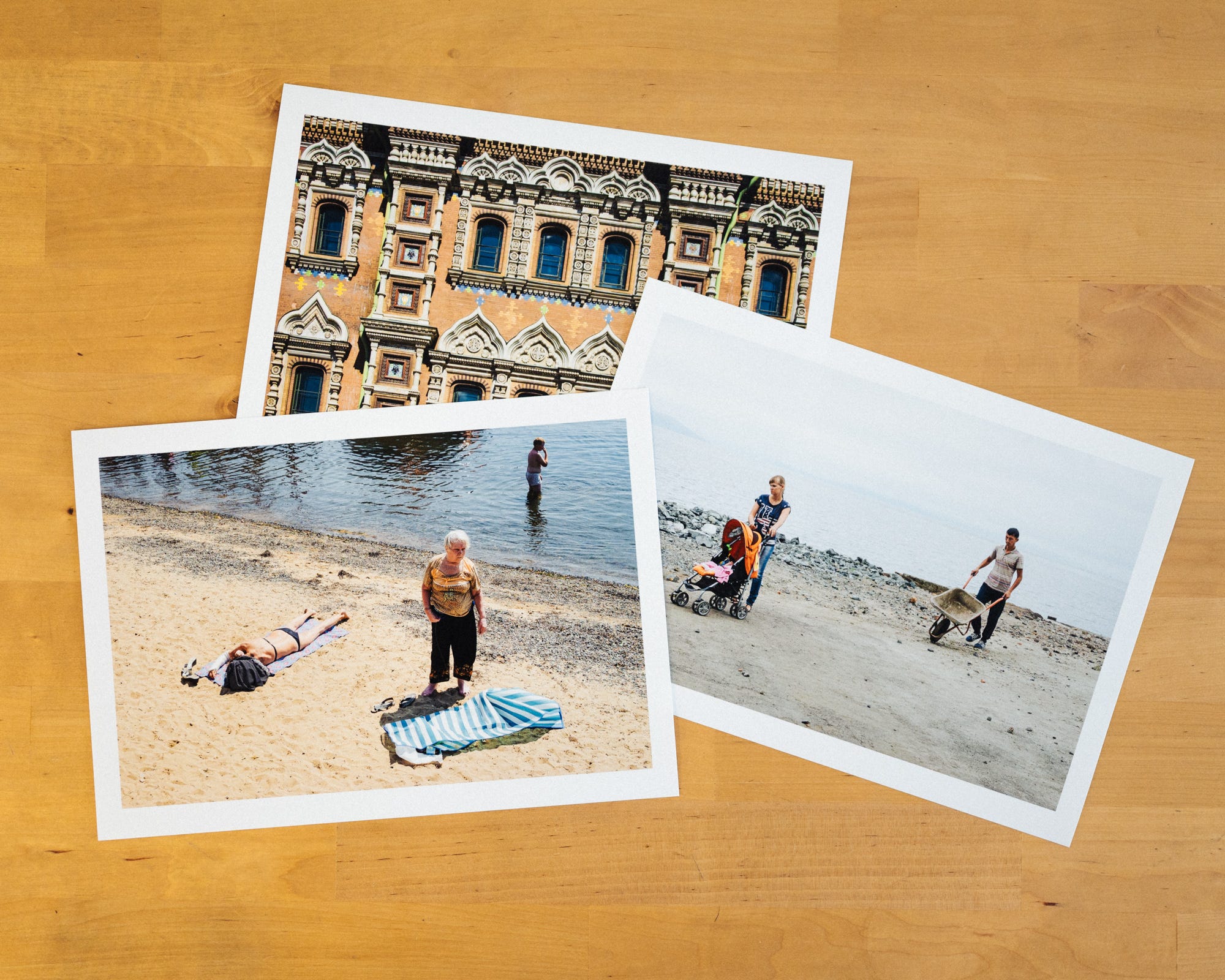
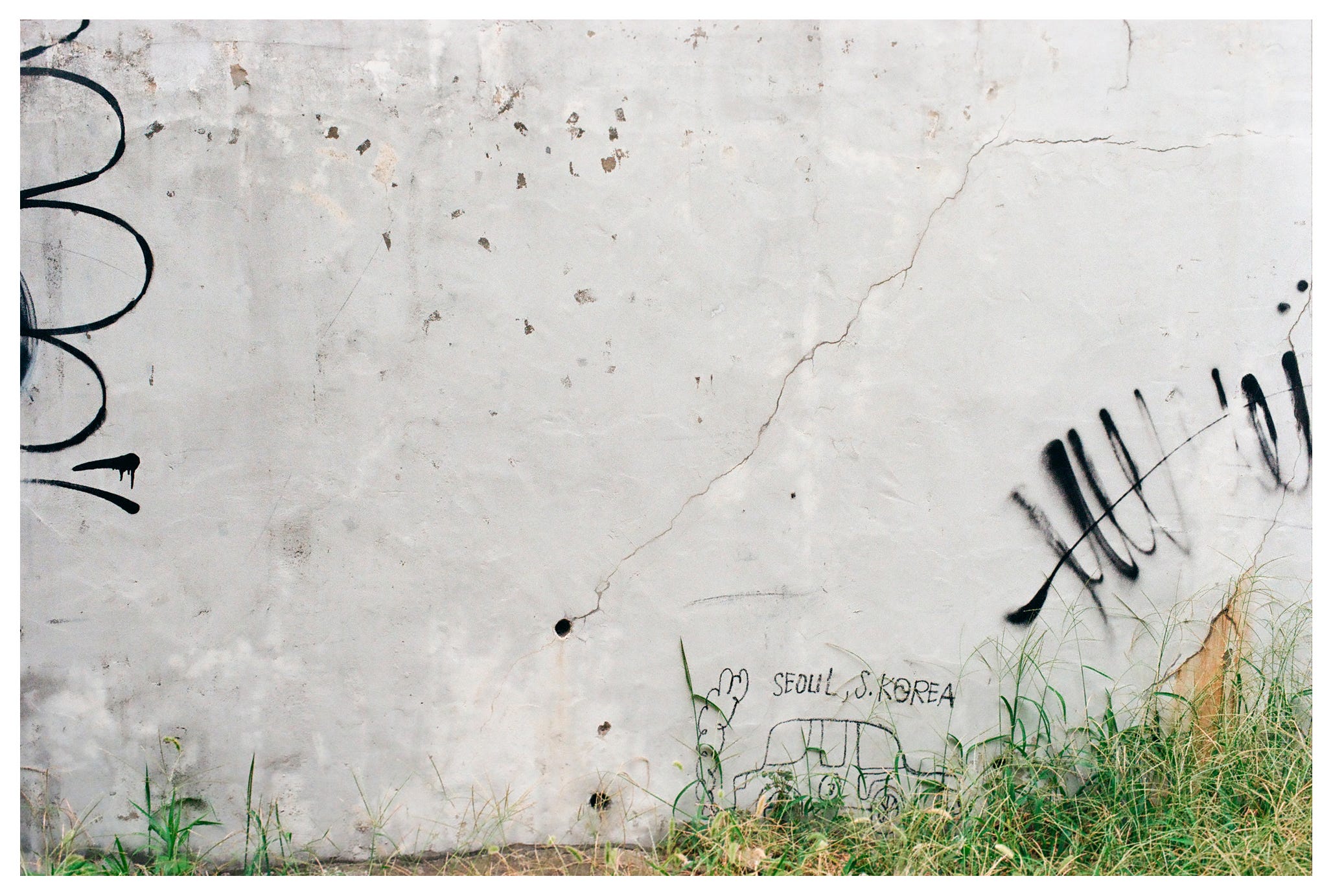
The way to do this is to have multiple points of interest in the frame, and ideally at different depths. I’ve written before about a trip I did through Russia, but here are a few examples of what I’m talking about, ranging in effectiveness.
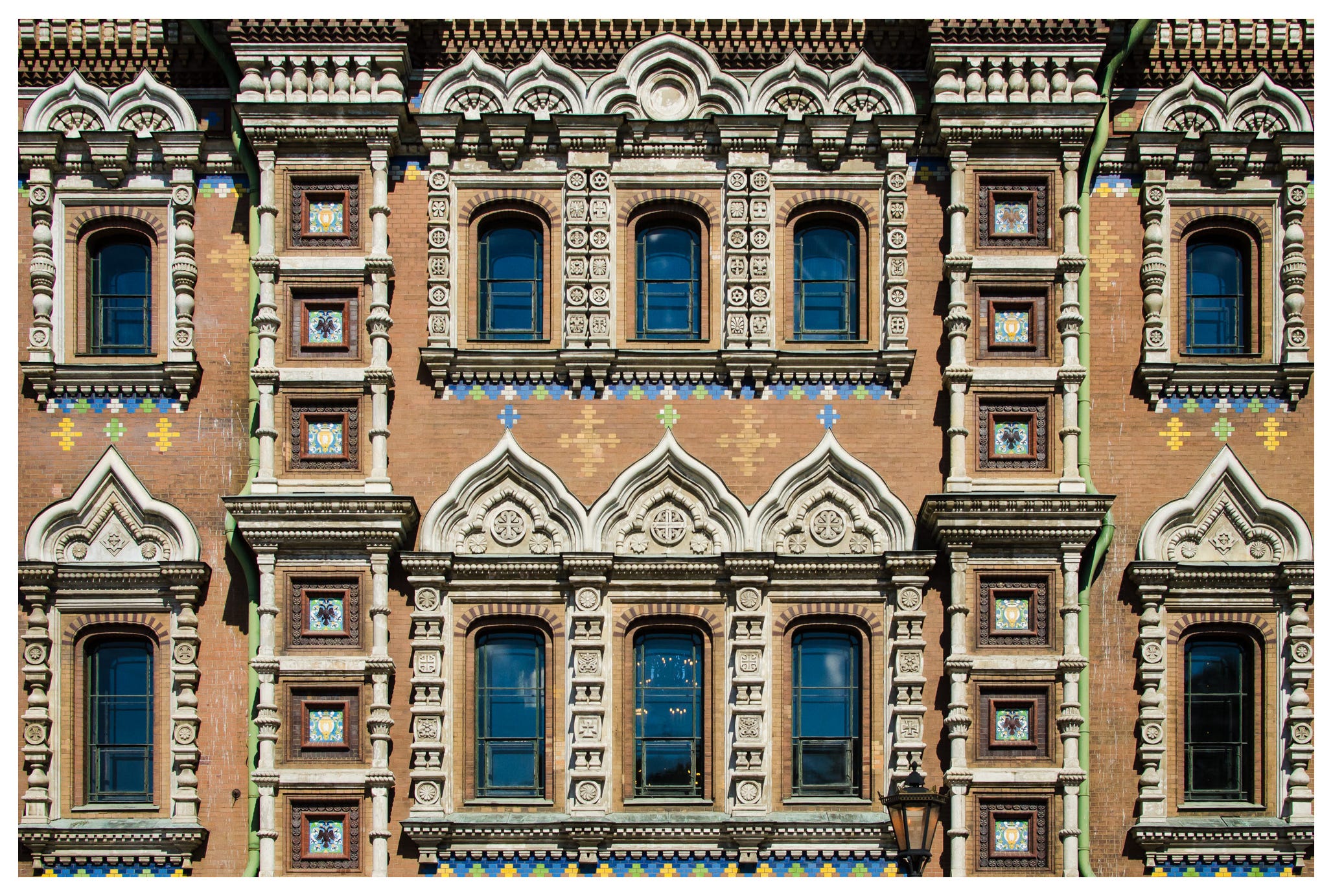
I was pretty much a straight up novice on this trip, and super concerned with making these really flat, geometric images back then.
When I look back at a photo like the one above now, I feel like my eyes kind of bounce off of it. Everything is on the exact same focal plane, and while there are different things to look at, I guess, I don’t feel like any relationships form between these elements. It’s not like a particularly enjoyable viewing experience.
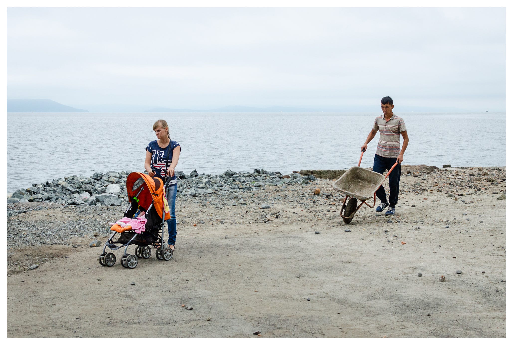
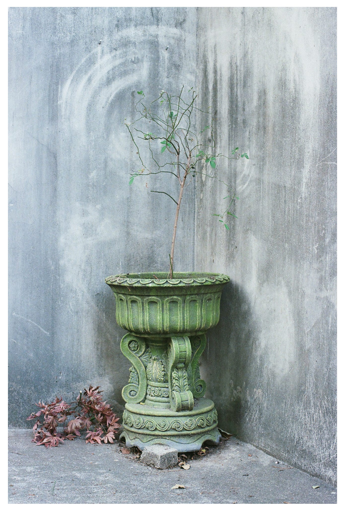
This next photo works better printed because there are multiple points of interest, so your eye has a chance to move here and there a bit. The space in the background also adds a sense of depth, like they subjects are standing off the page. But overall there’s still a flatness to this image that I think prevents it from really working in an interesting way.
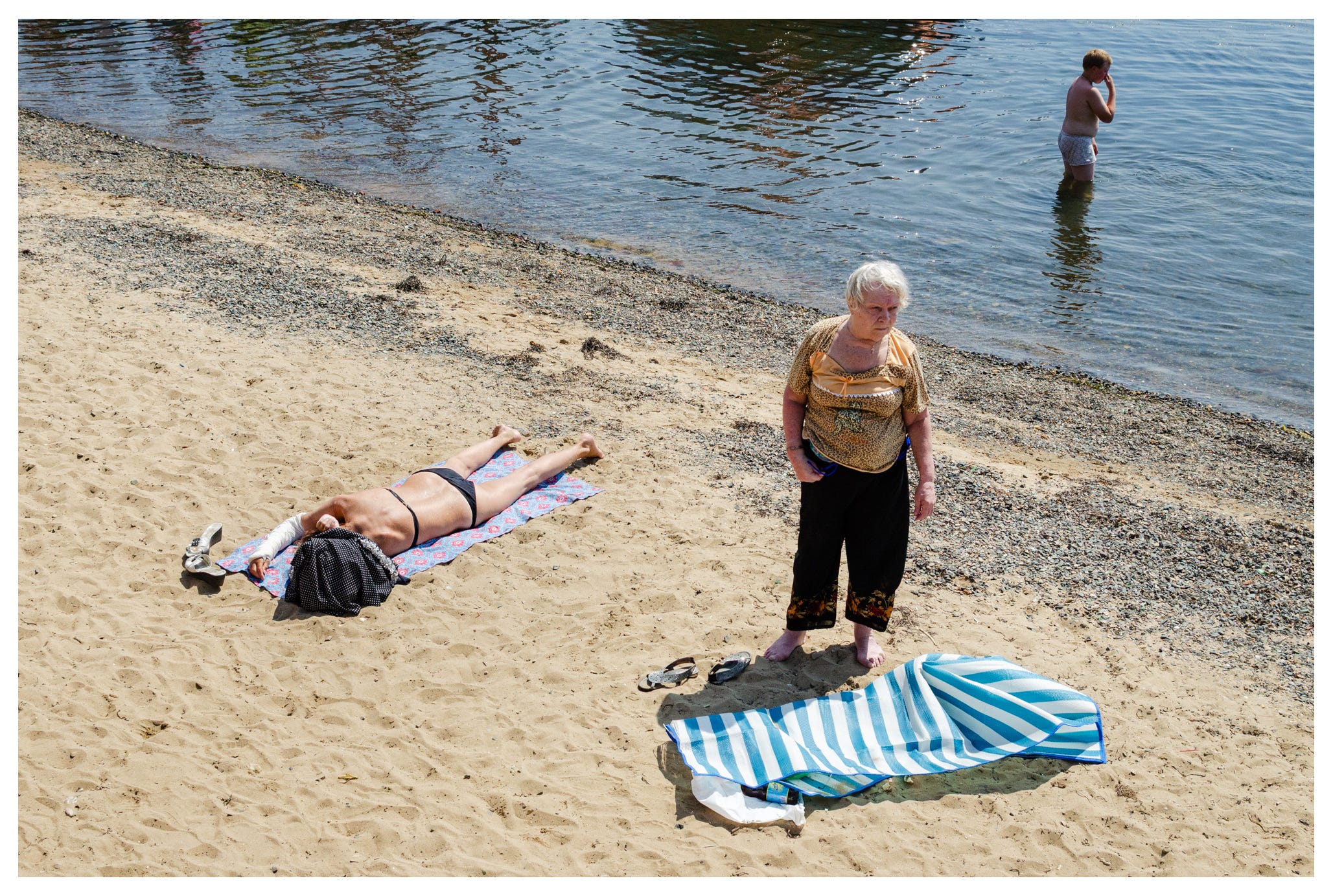
I think this last photo works the best in print. There are multiple places for the eyes to move to, and this gets the reader to start forming relationships between these elements. There’s also a sense of moving further into the image to see the kid at the back, then moving to the front to see the woman, then into the middle distance to see the woman with the broken arm. The reader’s eye is moving on a flat plane, but it feels like it’s moving into and out of the image.
Adding dimensionality to a flat print by having depth in the image can really make for a result that connects.
Pick a Focal Length
Please consider this next suggestion only if it fits with what you’re doing - but try picking only one focal length for a print project.
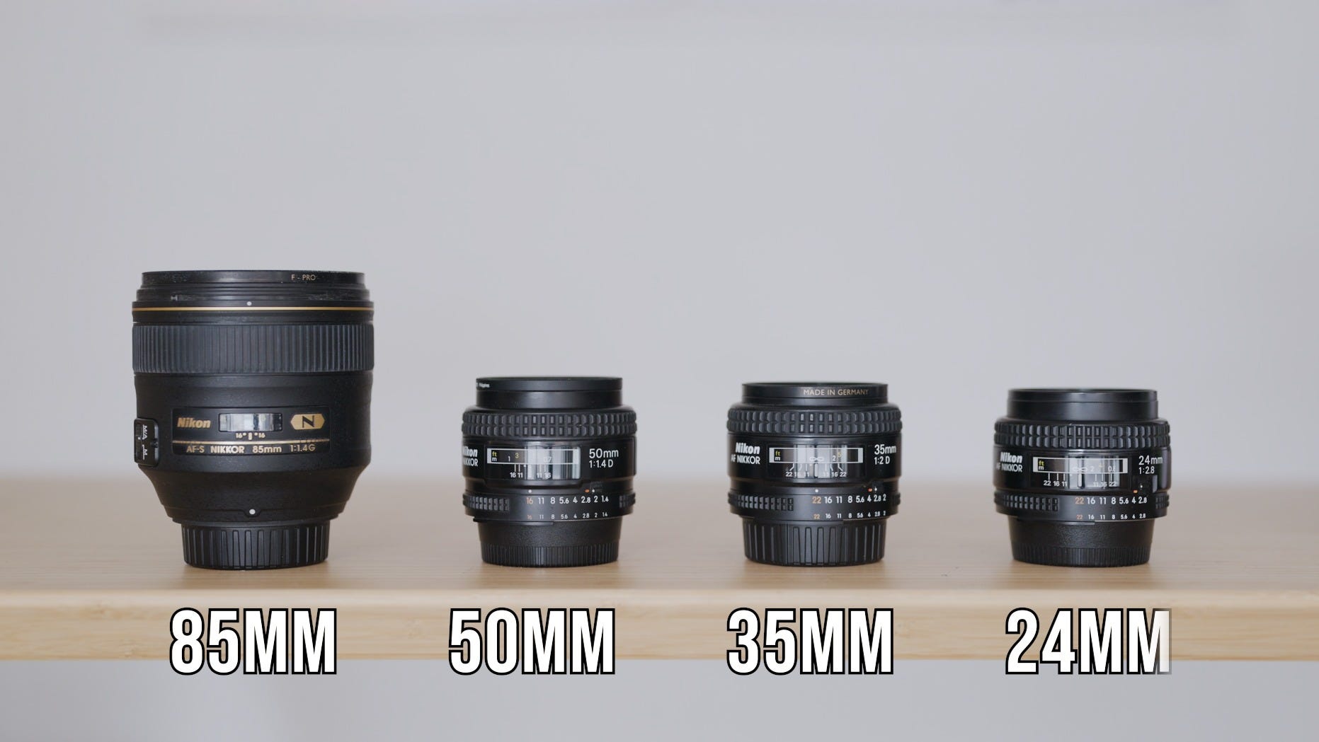
The best description I’ve heard for focal length is that it’s like the tense of your images, and every creative writing tutor agrees: regular switching between tenses can be a bit disorienting. Working with a specific focal range for the duration of a project will add an overall sense of cohesion to the sequence of images you’re presenting.
Again, this will depend a bit on how you work, but in my opinion:
Shooting very wide, say at 24mm, offers a somewhat destabilising, immersive perspective that enters into the subject’s personal space.
Shooting a more limited wide angle like 35mm makes for a fairly naturalistic image, one that is somewhat suggestive of a normal field of view.
I find 50mm to be personally observational, as if you’re not only looking through the photographer’s eyes, but are also in the photographer’s headspace.
Then as you get narrower, say 85mm, the images feel like photographs of something over there, introducing a sense of distance between the photographer and the subject.
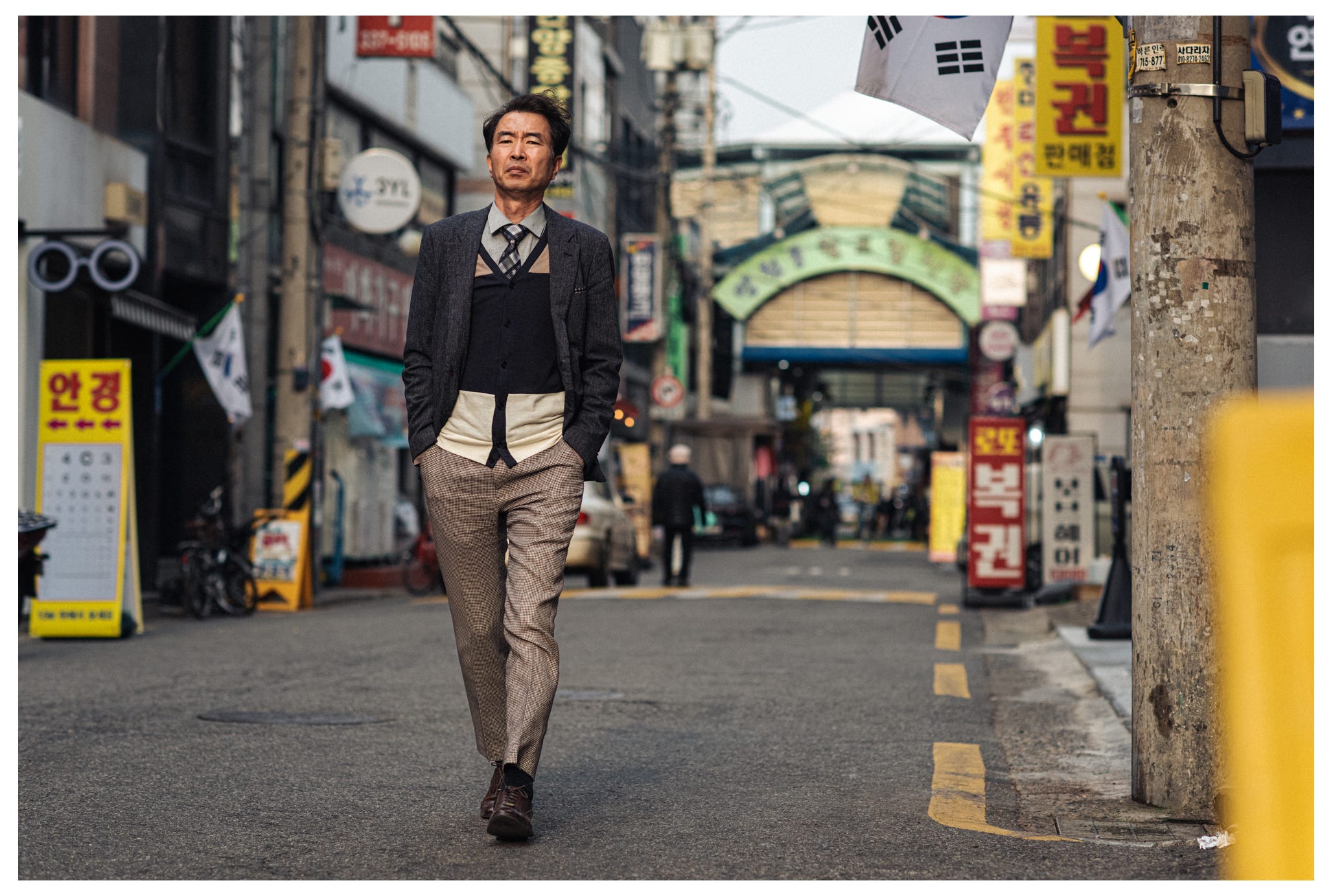
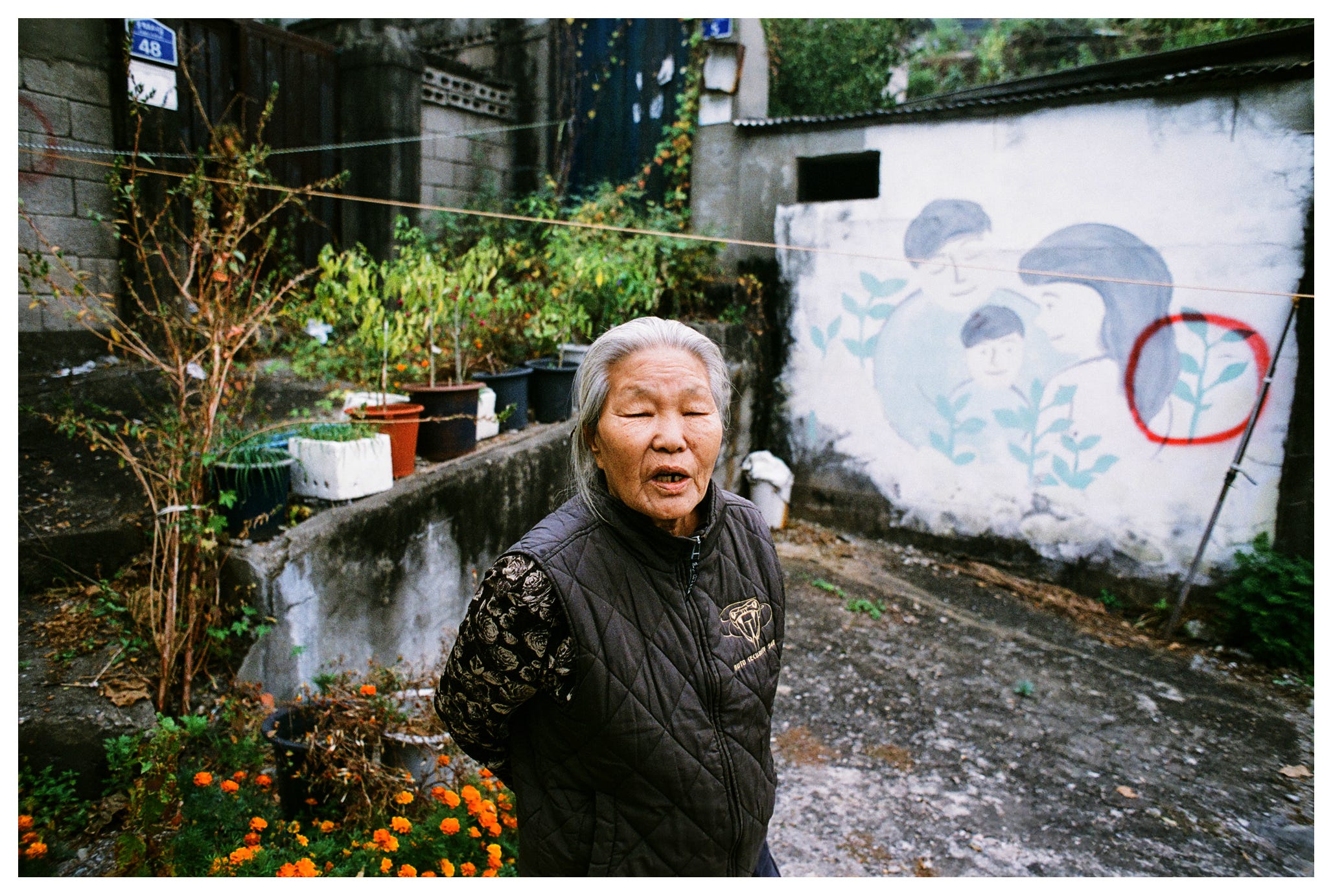
For Serial Music I went with a 50mm. I wanted to leave the reader with this sense of just how I see things here in Korea, and so I picked a focal length makes images feel like observations. I wanted to say, here’s my view on this place, my experience.
My point is that different lenses and different focal lengths carry different connotations, and these connotations are emphasized in print. When you know what you’re trying to communicate, think about which focal length might best support that.
Be Honest
My last suggestion, and this is for photography in general but it really shows when printing, is to be honest with yourself. Is every bit of the image worth looking at?
When framing up and selecting your images, you’ll know deep down if there are parts that feel like they don’t add to the power of the image, or worse, they take away from it. I’m not saying images need to be super busy, but when you objectify an image in print you’ll find yourself looking at the whole thing, border to border, not just the bit in the middle you were focused on when you took the shot.
If you treat the entirety of the frame with care as to what is and isn’t included, you’ll find your images imbued with a kind of solidness, or dignity when they’re printed, and I think you’ll find it can elevate an otherwise simple photograph.
If you’re reading this, chances are you know someone who’d also get something out of what I’m doing here. I’d love it if you passed on the video version of this article to your friend - at the very least they’ll know you’re thinking of them.
Cheers,
Chris ✌️
This video was so great and nice to revisit these ideas here in the newsletter. I've been thinking a lot about it in the last week - really love this challenge of sequencing photographs in a way to intentionally direct the viewer's eyes in a lively, unexpected way from one composition to another. I'm definitely on board the print small train too - it's great to have a little test print and live with it for a bit to really know if it is a keeper. Love that shot with the green planter!
Thank you. This is such a useful article. I found the part about focal lengths especially useful