


∴A Photographer's Golden Rule for Design∴
And how I used it to design 12 photo zine covers

There’s a tension at the heart of my photography process:
I am not a designer.
I want to make things with my photos.
These things require design.
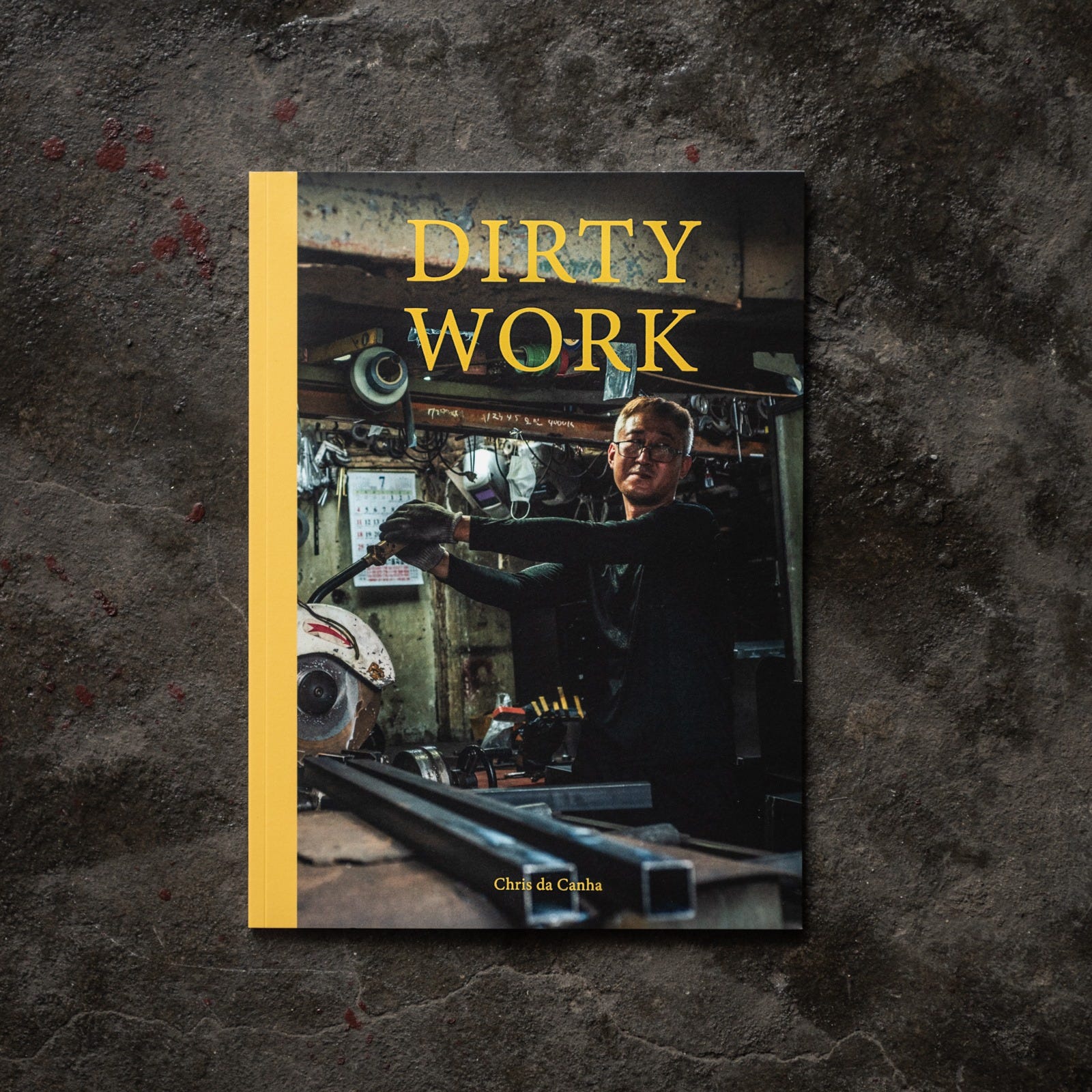
This tension inspires a fair bit of insecurity in me, and for a long time it prevented me from making much at all. I eventually confronted this insecurity head-on in 2021 when I made my first zine Dirty Work.
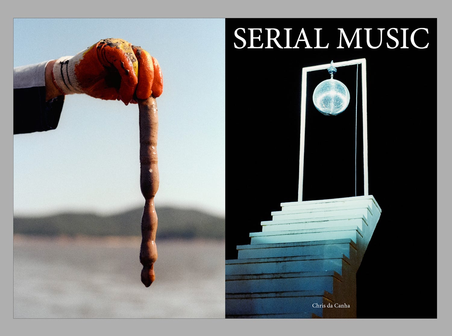
Bringing that project to realization helped me muster the courage to take on my next, decidedly more ambitious project - making a zine a month for a year. If you’ve been reading this newsletter for a while, you’ll be no stranger to Serial Music, the admittedly opaque name I’ve given this endeavor. Today I want to share about my Golden Rule for Design (as a non-designer), and all the ways this rule was used when designing a cover that would work for 12 separate zines.
My Golden Rule for Design
Simply put, my rule is this:
Have reasons for your choices.
This might seem like a no-brainer, but every time I’m stuck on some part of a project - How do I do the cover? How can I sequence these images? Should I write my zeros clean or with a line through them? - resorting to my golden rule provides the clarity I need to move forward.
Professional designers have a complex understanding of what elements work together, and why. This is what allows them to make designs that seem ornate or complicated without feeling cluttered or excessive. My knowledge of design isn’t at that level, but I won’t let my recognition of that fact stop me from making books and zines with my photos. Rather, I scale back my design to a level I can manage, and build it up from there. Let me show you a few examples from the cover design choices I’ve made for Serial Music.
Logo
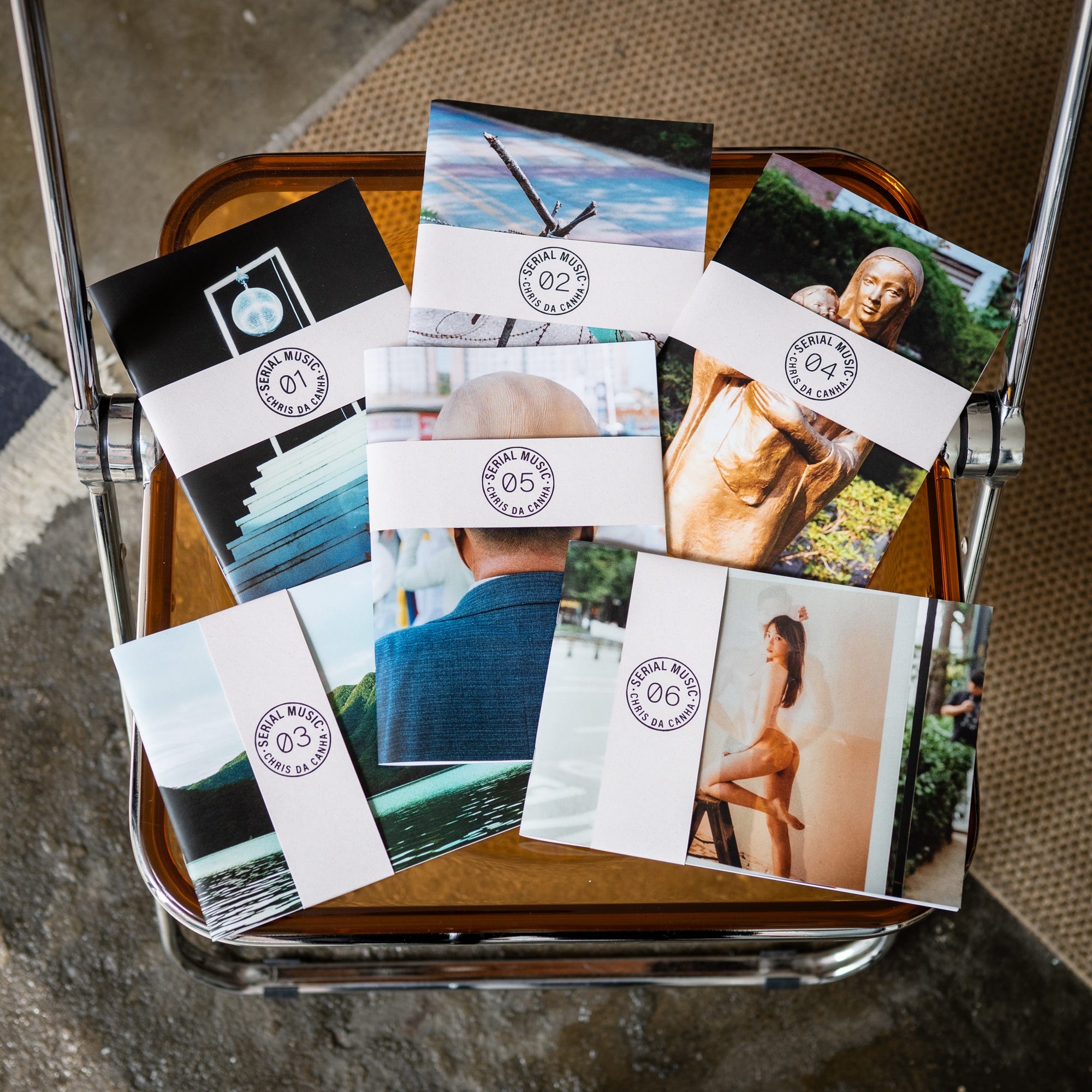
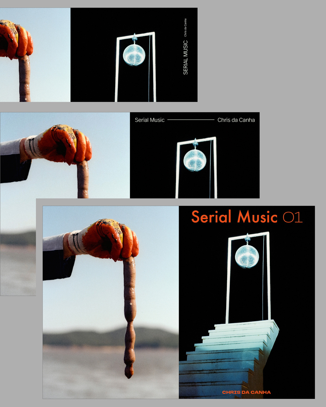
While I always knew I wanted an image pair for the front and back covers of Serial Music, figuring out how to get the title and my name on there was a real challenge. This is a 12-zine project, and whatever I designed needed to work over 12 different cover images.
I started simply with the title on the top and my name at the bottom. It looked alright on Serial Music: Vol. 01, thanks to the ample negative space of that particular cover image, but the text would get lost on many of the other covers to come. It also looked too similar to Dirty Work, and something about printing the text on the cover made the zine look a little amateurish.
I asked my wife to try mocking up the text in a few different ways - she’s more the designer of the two of us - and while her font choice and placement looked better than mine, they faced the same issue of not being appropriate for many of the covers to come.
I searched out references on Pinterest and Instagram, and, playing off the music idea, researched the sticker design used in the center of old vinyl singles. Something eventually clicked and I decided a logo, being more graphic, would probably work better than text.
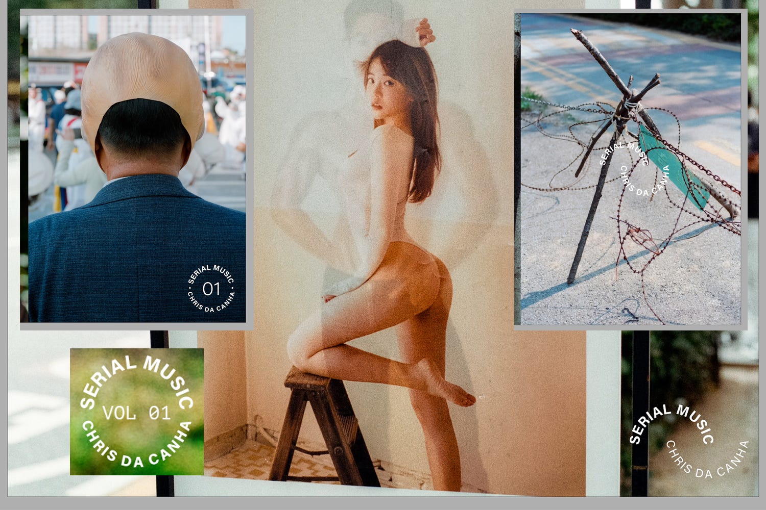
I mocked up two or three possible logos on InDesign and Photoshop, and after trying them out on multiple covers, settled on the final circle design. The logo bears only one flourish - two dots separating my name from the the title. I included these for a reason. Serial Music is a project about making meaning from image pairs. I’ve long loved the idea of Venn diagrams, and how the overlapping circles produce some new meaning that is bigger than its constituent parts. The two dots - equal and balanced, are a subtle allusion to how the coming images will work in pairs.
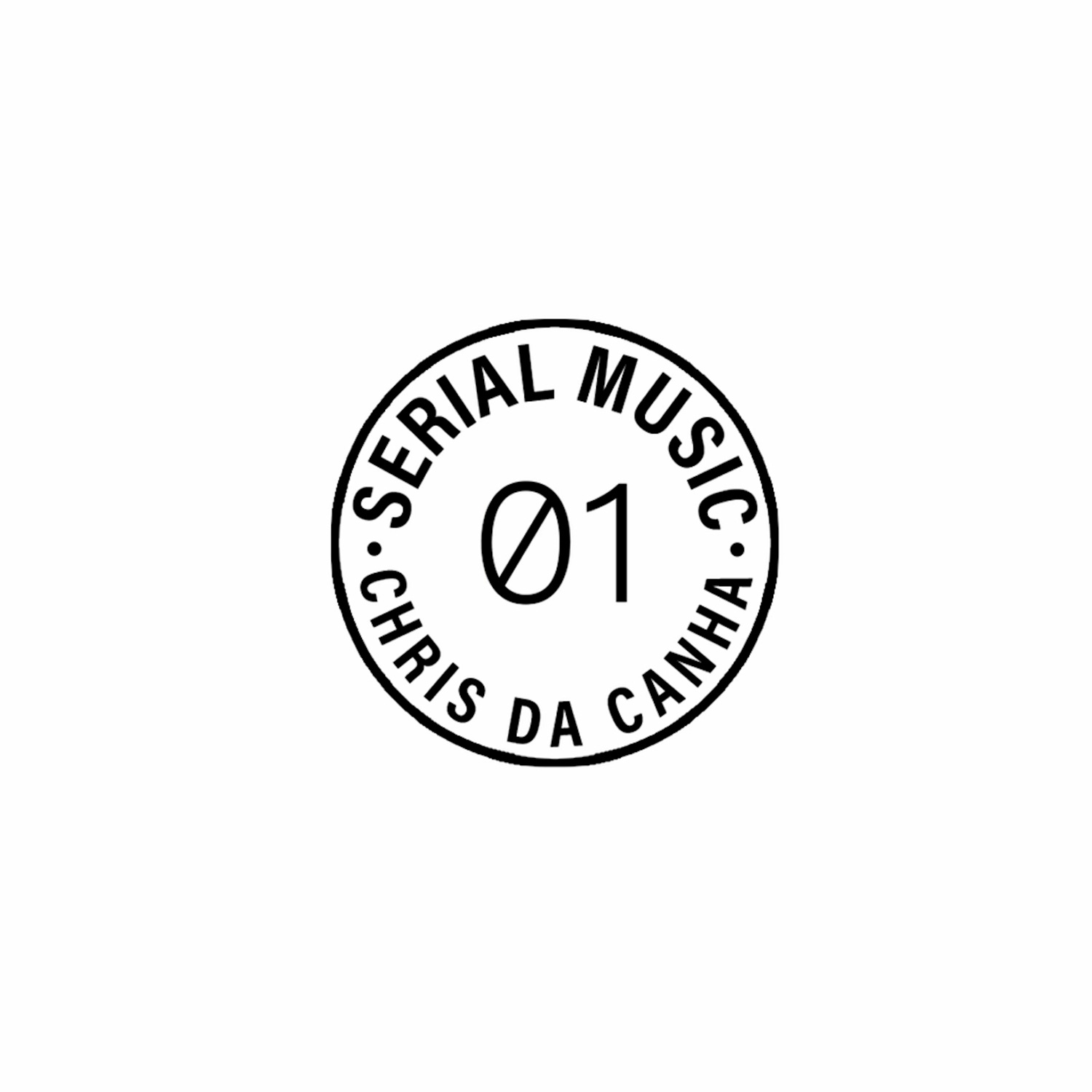
Additionally, I selected the slashed zero for the issue numbers. By dividing the zeros into two halves, it’s another subtle reference to the coming pairs. I don’t expect this to necessarily be clear to anyone glancing at the logo, but for anyone who interrogates the design choices, there’s something to be found.
Ribbons
There was still the problem of where to put the logo. I wanted it in the same position for every cover, but it clashed with some of the cover images. I was stuck at this point for a long time with my product deadline looming, when I finally decided to change tack. If the logo wouldn’t work in 12 covers, maybe it would work on 12 covers instead.
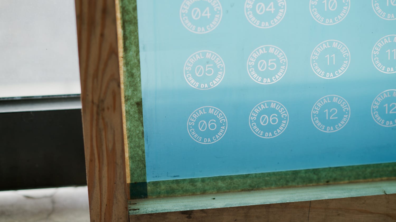
I sent off my logo to a local silkscreen maker, and a few days later braved the drive to the heart of an Asian mega-city to go pick it up. Next, I visited my neighbourhood paper dealer, a place that is spilling overwhelmingly with hundreds of paper stocks. I dirtied dozens of the sheets, rubbing them between my thumb and forefinger as I tested their coarseness and heft, eventually deciding on something called CRUSH 128. Back in the studio, I got out all the gear and screen-printed the logo onto a freshly cut ribbon of paper.
The screen printing process is a little tricky to show here in text and image, but you know I’d never leave you hanging. Check out my latest video to see how I’ve been screen printing the ribbons, and watch as my lower back slowly dystrophies over the table.
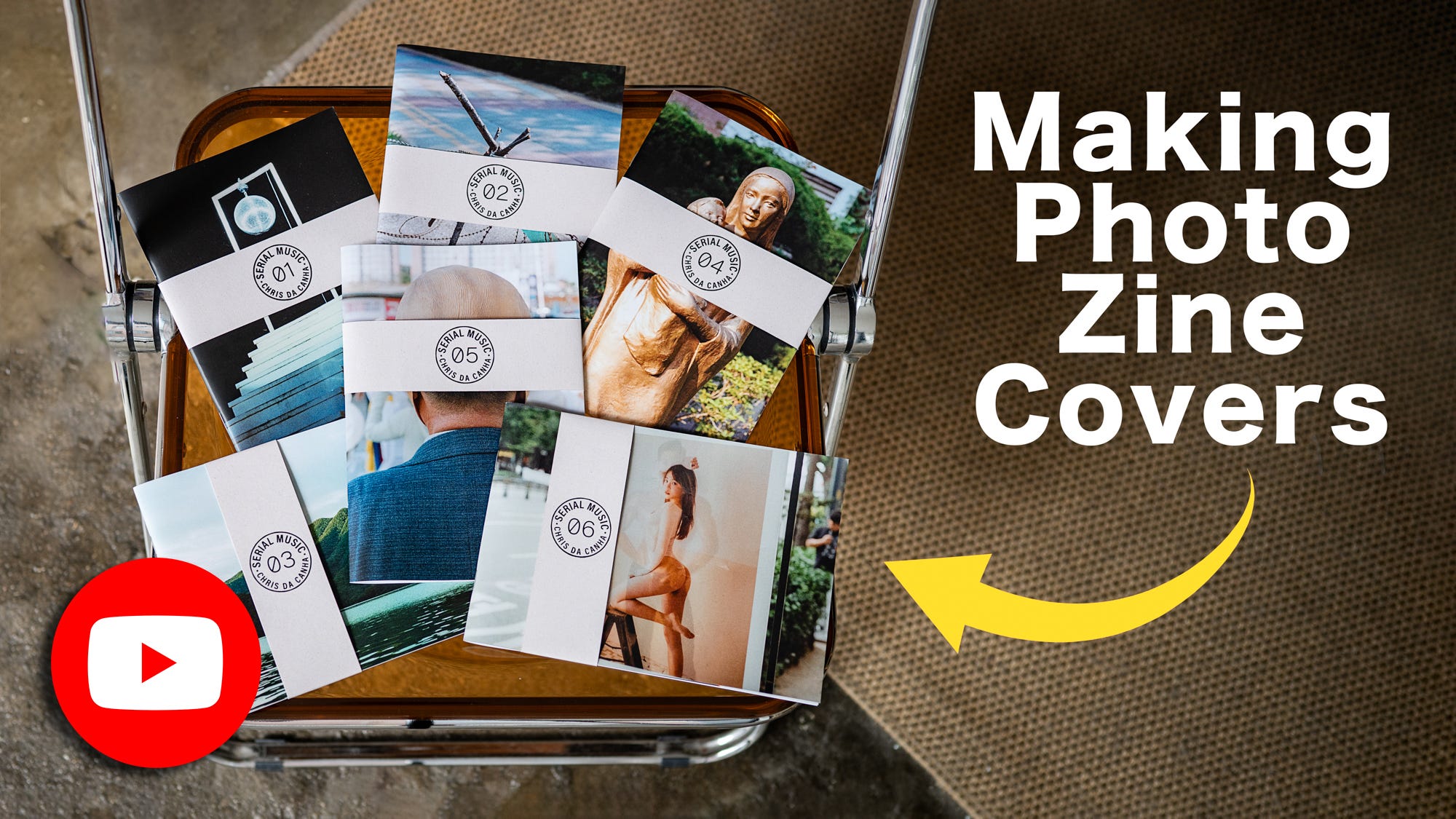
Once the screen printing was done, I grabbed a test copy of SM01, wrapped the ribbon around, glued the back and flipped it over. There lay the look of the zines - a photo cover wrapped with a screen printed paper ribbon. Progress.
Emboss
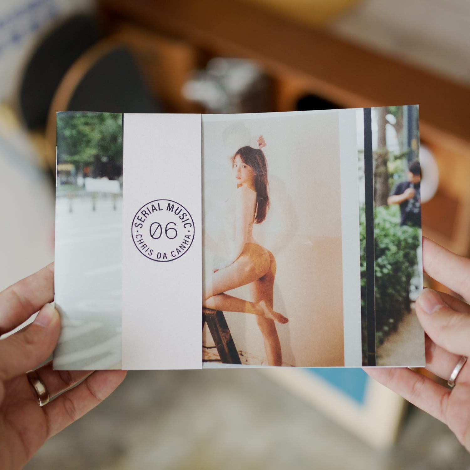
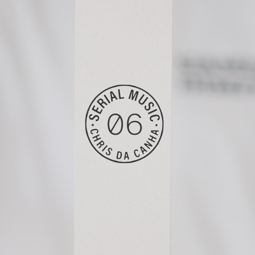
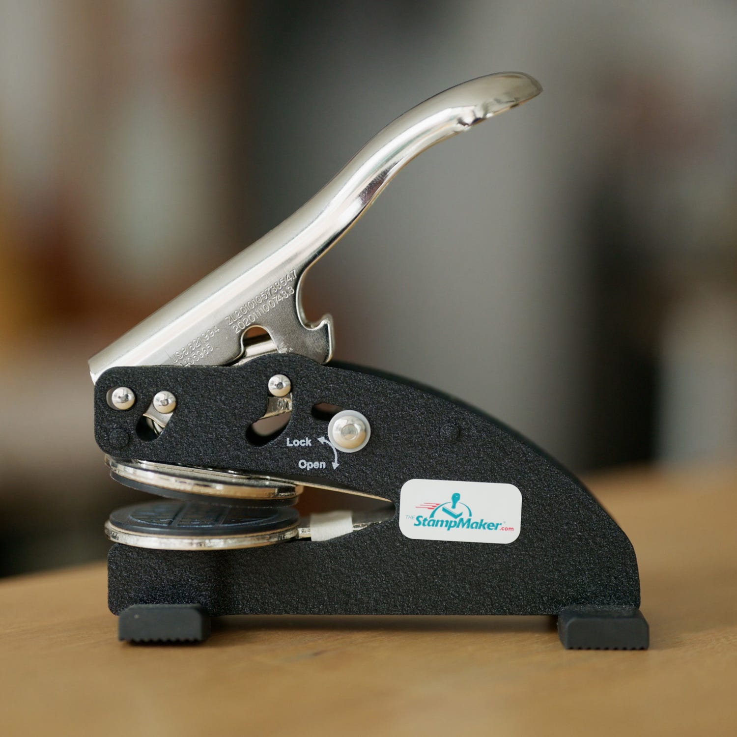
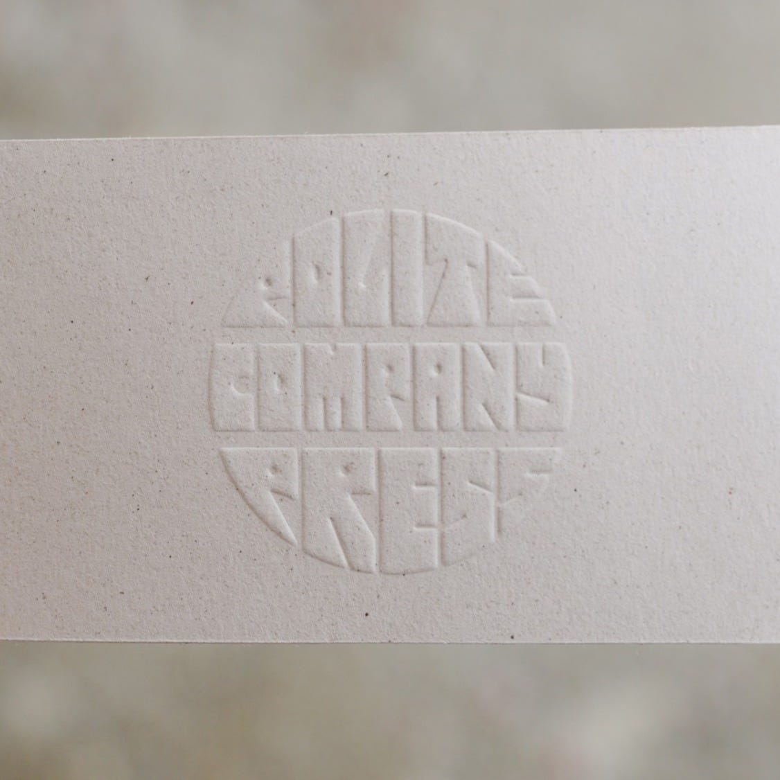
Next up I needed a way to include the logo for the small indie publisher my wife and I run - Polite Company Press. Screen printing this would require a lot more time, and for some reason it didn’t feel quite appropriate for the ribbon. Instead, I found a stamp maker based in the UK that could make an emboss stamp with our logo, and decided that would be a better fit. I designed our circular logo to be the the same size as the Serial Music logo, sent off the order, and in 2-4 weeks I had the stamp on my desk.
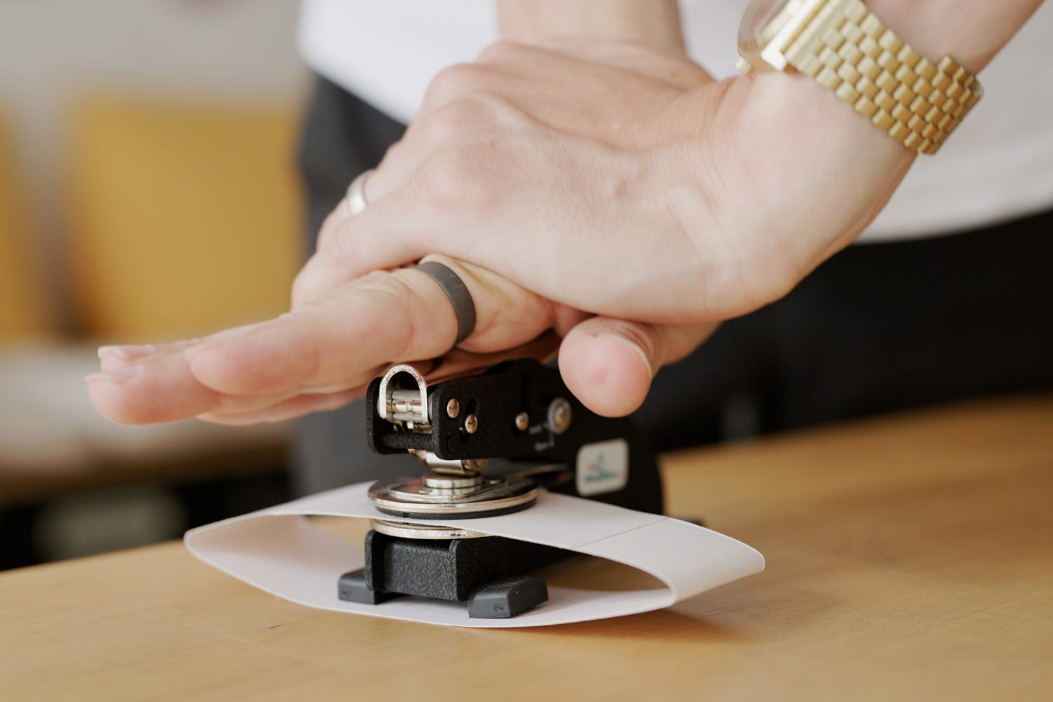
I decided to place the emboss on the back of the ribbon so it was lined up with the logo on the front, meaning the two circles would sit more or less perfectly on top of each other. Again, the thinking here had a reason - the two circles are another subtle nod towards the overlapping circles of a Venn diagram, this time fully eclipsed1. I try to make design choices that don’t scream my intention, but provide some insight into my thinking if anyone’s looking closely.
Extras
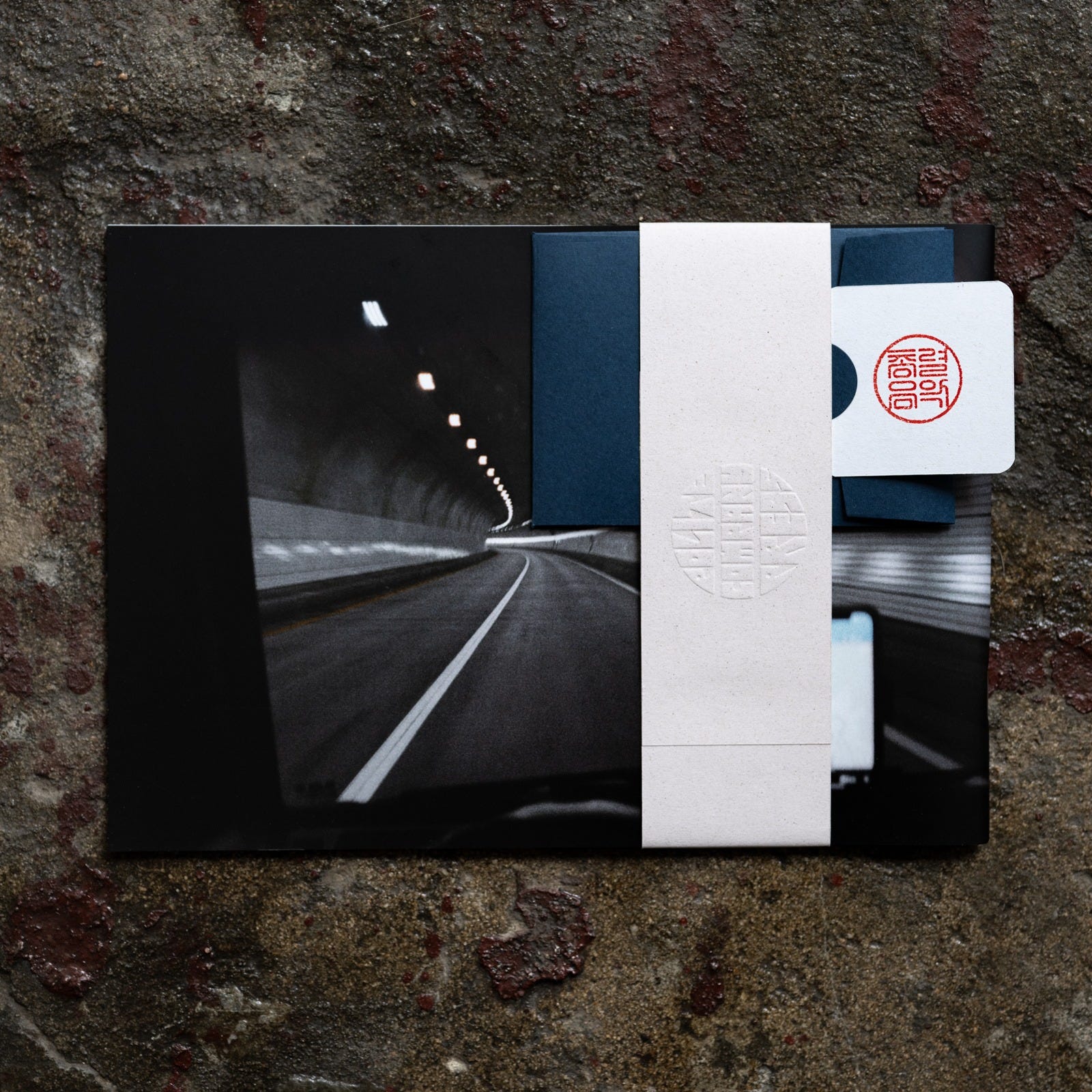
I finished off the presentation of the zines with a few extra elements - namely an envelope with two mini prints, and an edition tab. For the edition tab, I visited a local traditional Korean stamp-maker who makes dojang (도장). These stamps are typically used to leave a bright red seal on official documents here. They’re all over my housing contract.
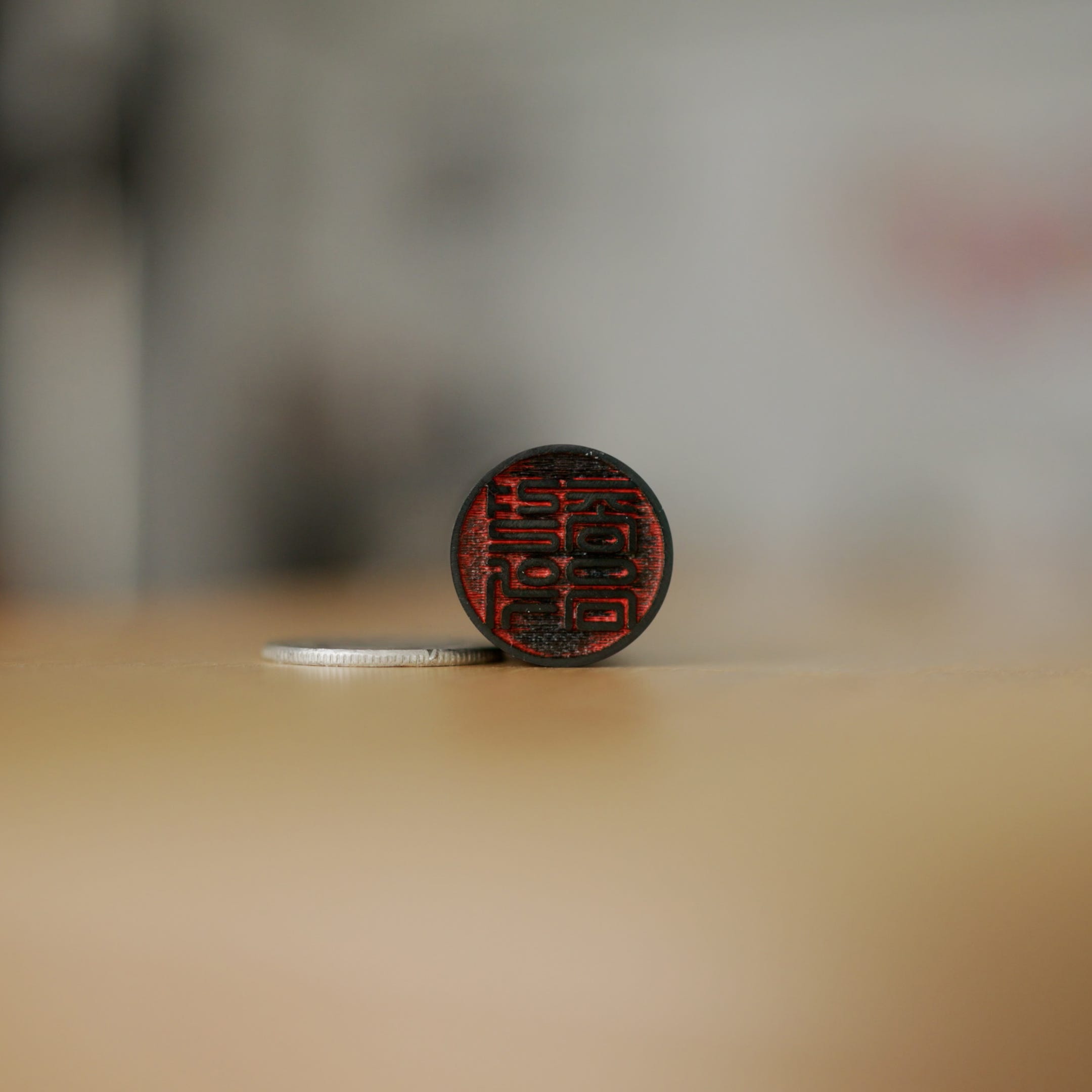
I brought a close approximation of the term ‘Serial Music’ written in Korean, and the stamp maker used some software to quickly mock up a few dozen potential fonts. After trying a few options at a few thicknesses, we made a choice and fired up his old tech, engraving the stamp then and there. I’ve used this stamp on every copy of Serial Music sold, so the owner knows the official edition they own. Ultimately, using the Korean stamp was a way to ink the fact that this was a Korean project. All the photos were made here, all the zines were made here and all the work was done here too.
Every time I come up against design, it’s a struggle. But by sticking to my rule and having reasons for the design choices I make, I always end up with a result I’m proud of. I hope this newsletter serves as a bit of encouragement for those of you who want to make something, but aren’t sure how. With a bit of time and thought, you can do it.
Check out Serial Music here, and the video here.
Cheers,
Chris ✌️
Speaking of eclipsed, one of my logo designs was actually done by putting text on top of an image of an eclipse. I liked the idea and it felt appropriate for the project, but it never looked quite right and I decided to nix it.
Your posts are endlessly inspiring and always seem to come about when there’s something I might be thinking of or already in the process of doing. I so appreciate the detail you go into with this kind of stuff and how it’s never in topics done a dozen times before.
I’m in the process of starting a film photography club (spurred on in large part by your post on the subject). As an Art Director, I get bogged down in process easily, ideas can never just be thrown out there to the public unless they are fully formed and visualized. Branding is always a key part for me and the most fun, but can take a while. But I want this club to be happening now, hosting photowalks immediately, so that posed a real conundrum for me haha. So I gave myself the weekend, following my own Golden Rule, similar to yours tbh, and boiled it down to something that is simple and focused but can be iterated on over time as the club (hopefully) progresses. Both needs met through compromise for the greater good.
Cheers, Chris!
I love how much attention you give these smaller details. It absolutely shows. Inspiring, Chris!