


∴How I Test Paper for Photo Printing∴

About halfway through last year I declared here in a fit of optimism that I was considering printing Serial Music myself.1 I bought 5 or 6 different types of paper and set about making print tests of the images. For one reason or another, none of the papers I found ever really satisfied me, and after nixxing the idea of inkjet printing the project altogether, I moved on.
It bothered me though, that I couldn’t seem to find anything that really worked for double-sided DIY2 photo printing. Once every month or two I’d scour websites in languages I didn’t understand that belong to countries where I’ve never been, but nothing ever looked quite right. Once every month or two I’d give up all over again.
This morning I saw some sharp winter light sitting on the couch, so I joined it with one of the first photo books that ever made it into my collection. I haven’t been through Chinese Live by my old favorite Fujio Saimon in a long time, but as I flipped the pages the window-light brought out all the texture of the fibrous paper. I was struck by how much more matte it was than I remembered.
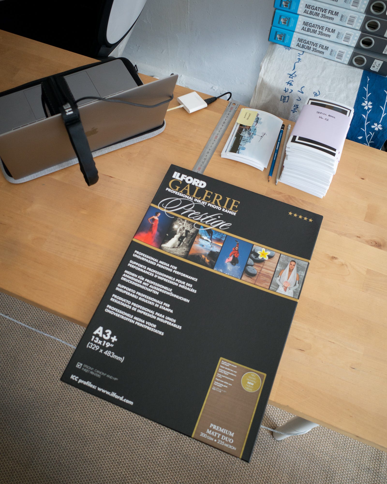
Then it came to me: I’d bought a box of Ilford ‘Premium Matt Duo’ nearly two years ago, and never opened it.
I’d picked up the paper aiming to try make an accordion book, but as my attention focused more on Serial Music, the idea and the paper dimmed into the back of my mind. The sheets were too big to be used as inside spreads in a book,3 but a quick look online showed A4 was readily available, and, surprisingly, quite a bit cheaper than I’d expected. Before I ended up with another box of unopened paper though, I thought I’d see what I could do with what I already had.
Making a Paper Profile
Heads up! Things are about to get a little technical, but I want to show the whole process. I hope it’s useful!
To really test the quality of the paper, it’s necessary to make a custom profile for it. A profile is basically a way to get the most accurate colour and tonal range for a specific brand of paper on your specific printer. There are a few steps involved.
Step 1 - Calibrate Your Screen
The root of quality colour lies in your screen. You want to be sure that what you’re seeing throughout the whole process is accurate, and this means your screen should be calibrated. Once every couple months I use this calibration tool by X-Rite to run a check and create a display profile (which is different from a print profile!) for up-to-date colour accuracy. That might sound odd, but screen colour shifts over time, and because it’s gradual it can be hard to notice.
Honestly, I’ve never seen a big difference after calibration. The first time I did it I thought I’d suddenly be seeing in the 4th dimension, but in reality it wasn’t much more than the greys being a little, I dunno, greyer. Nevertheless I’ve seen horrendous screens out in the wild, so calibration is certainly worth it if you have the chance.
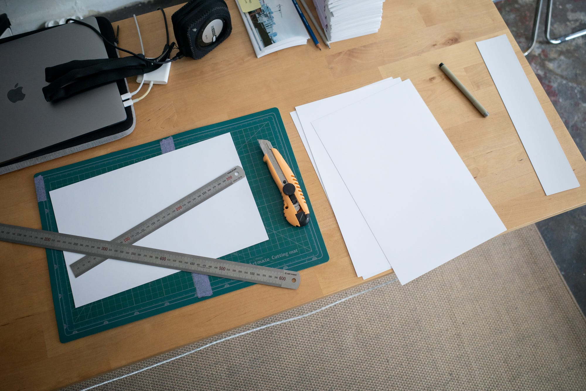
Step 2 - Cut A4 Sheets
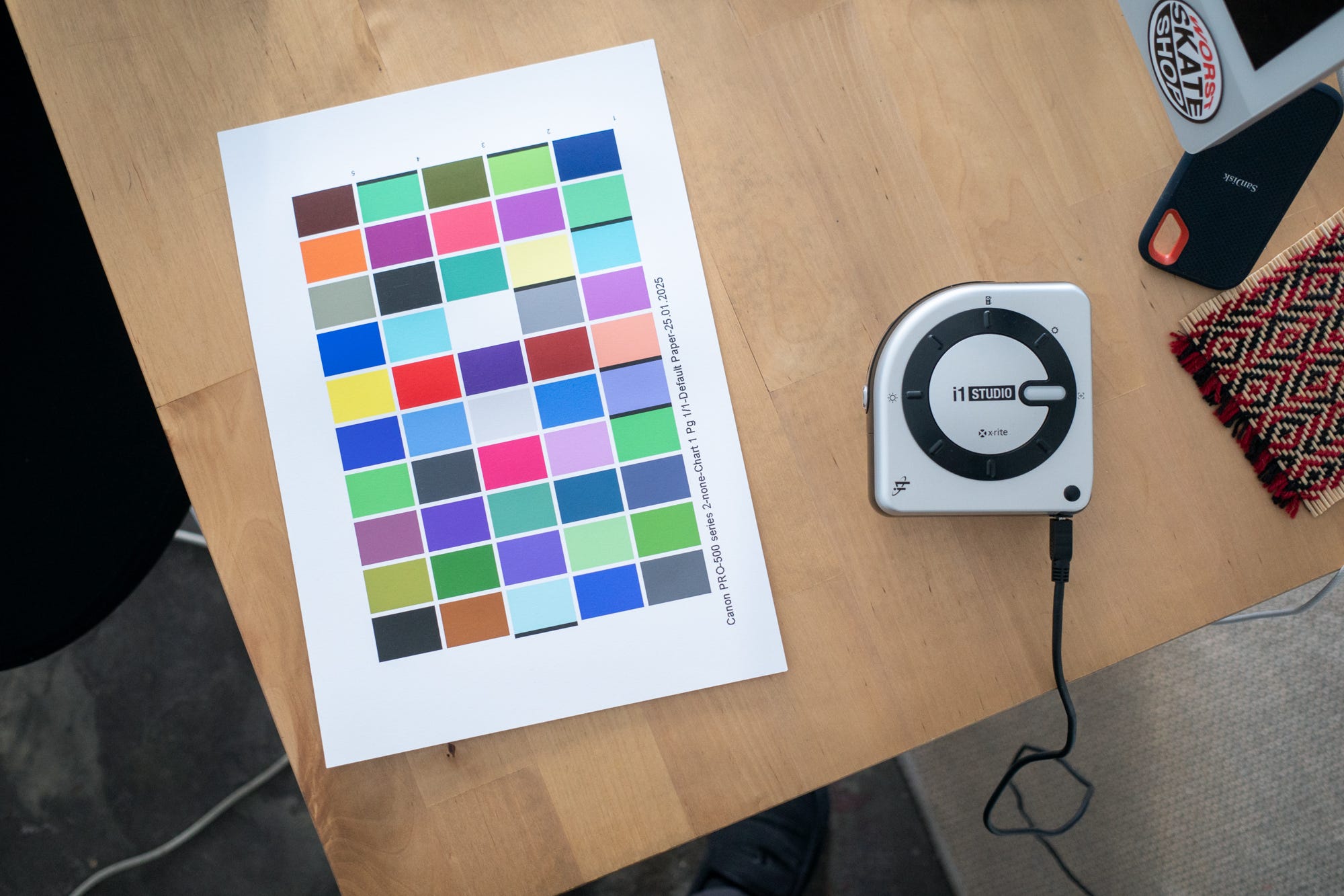
Next up is prepping some sheets of paper for printing swatches. These swatches are used for measuring the output of your particular paper/printer combination. As I had A3+ sheets (which are a little too big) I cut a few down into four A4 sheets (‘Letter’ if you’re American). A4 is plenty for the swatches.
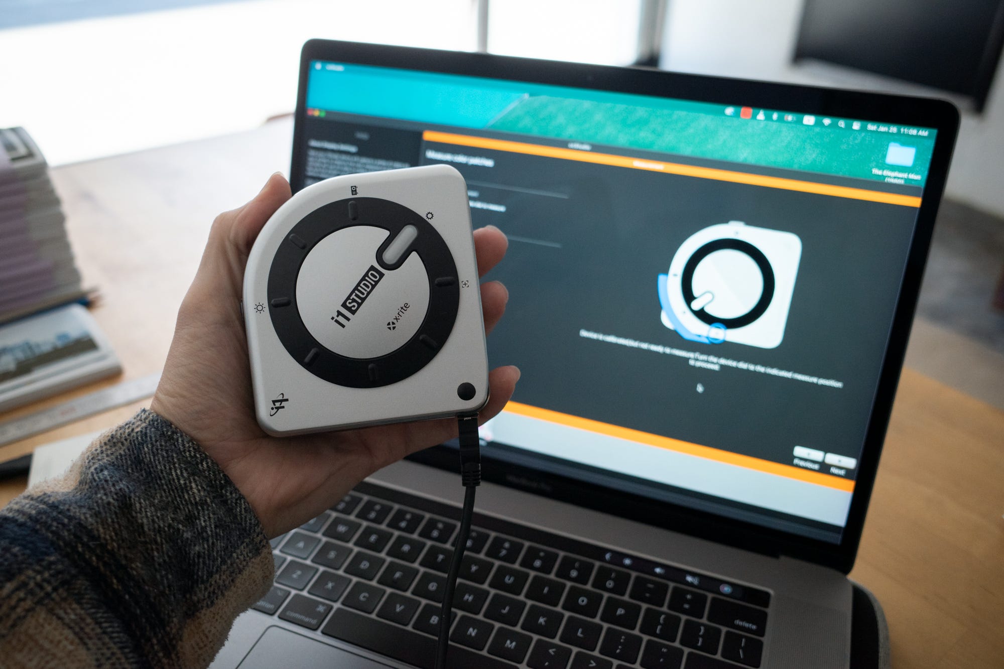
Step 3 - Calibrate the Calibrator
After loading the first sheet of paper triple check your print settings are matched with the paper you’re using (in this case matte) and that you’re printing at the highest quality possible. Seriously these settings will change on you if you’re not paying attention. They seem to love to revert to paper stocks I’ve never even seen let alone printed.

The software will then ask you to complete the Escher-like task of calibrating your calibrator. Basically its little lens turns inside itself and takes a reading of some true value inside and then it pops back out and is ready to go.4

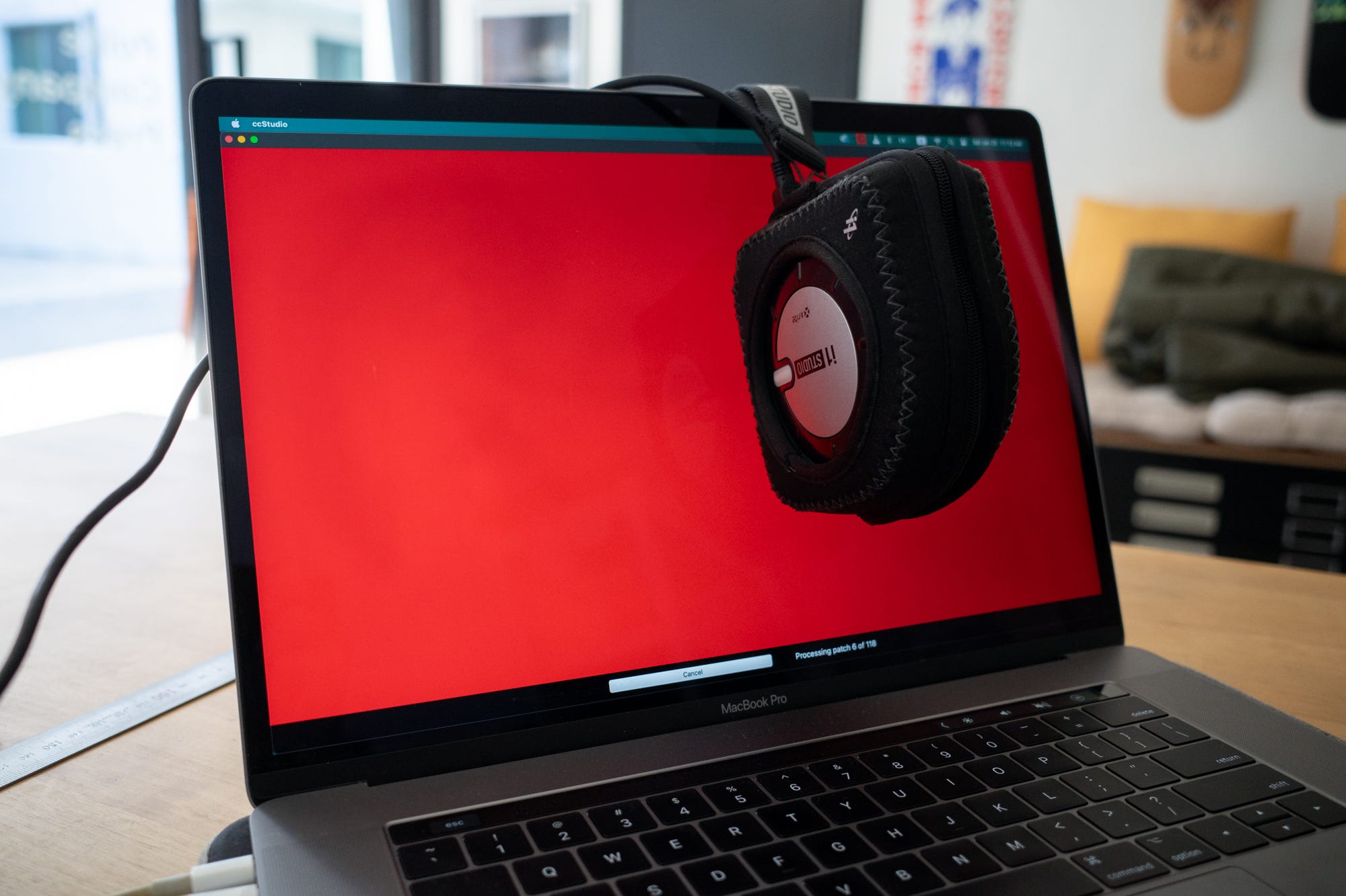
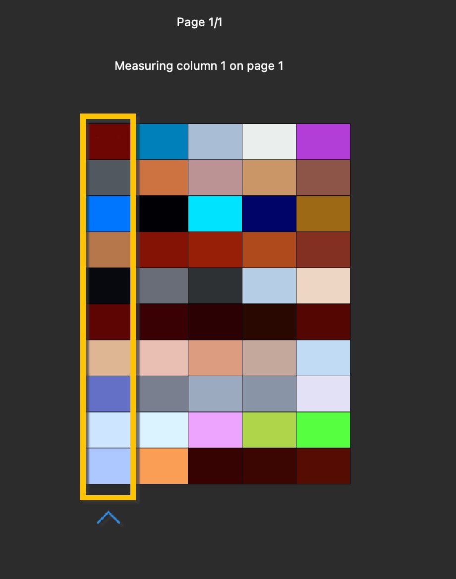
Step 4 - Print the First Swatch & Measure
Once the first swatch has been printed and dried (say, the time it takes to make a cup of coffee and have it cool enough to start drinking) put down your cup and place the calibrator on the first row of colourful blocks. Squeeze the button, and run the lens smoothly over the blocks in a straight line. If the computer is satisfied it’ll make a happy little gurgling noise and you can move on to the next row.
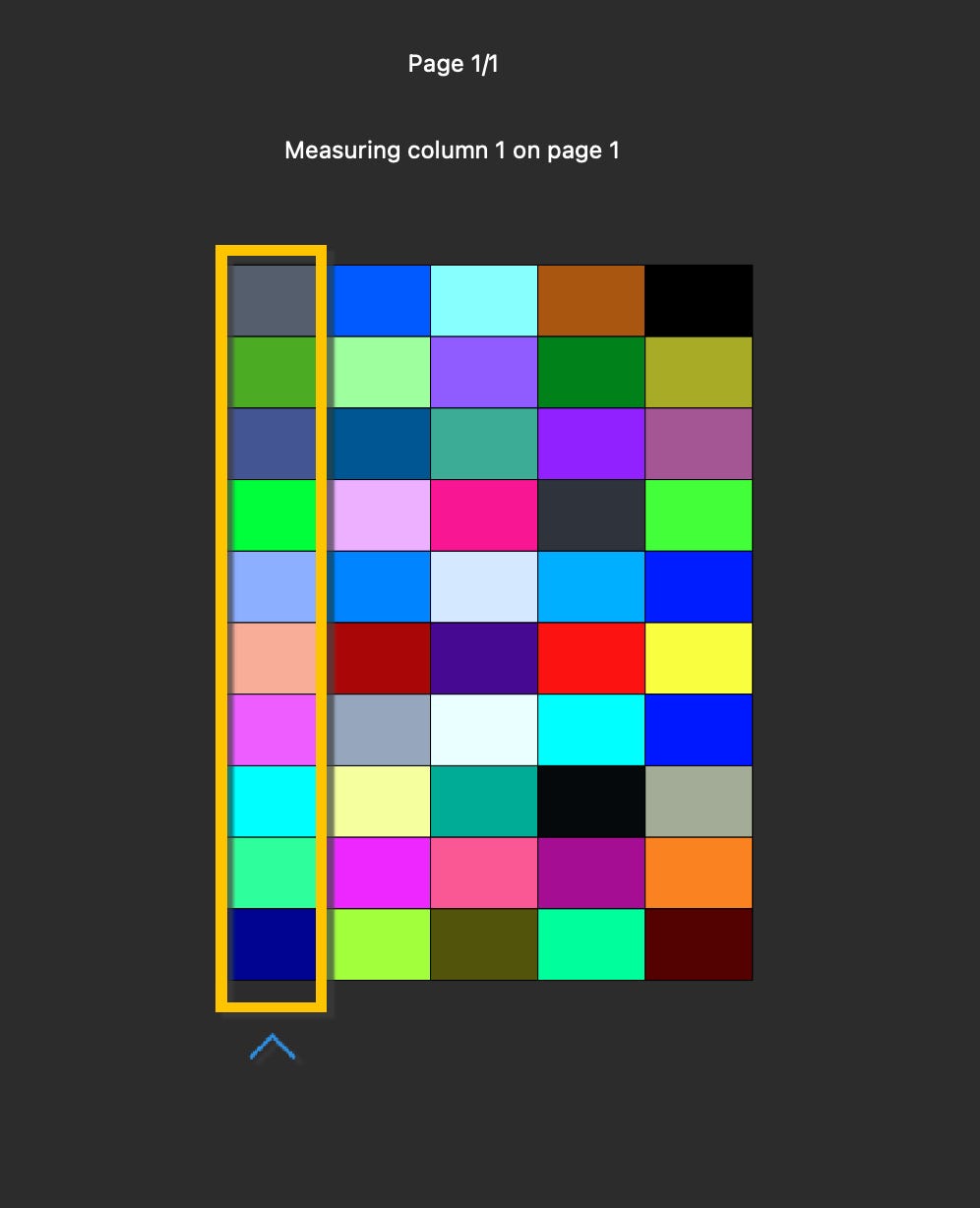
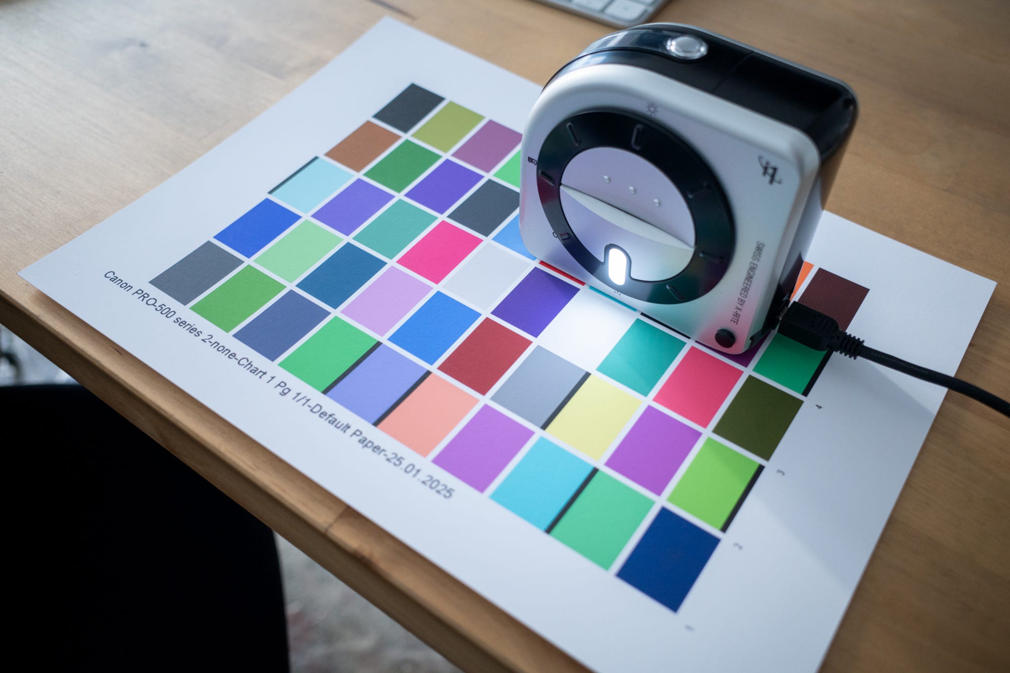

Step 5 - Do It Again
Step 5 is to basically repeat step 4, just with a second, more aloof set of colours.

Step 6 - Save Your Profile
Your computer should cobble together a print profile now that you can use to simulate on screen how an image will look printed. Save it, and we can move over to your preferred image editing software.

Step 7 - Soft Proofing
I don’t want to get too into the weeds about printing in Lightroom here, so please know I’m skimming a little bit. I’ll no doubt get into it in a later newsletter.
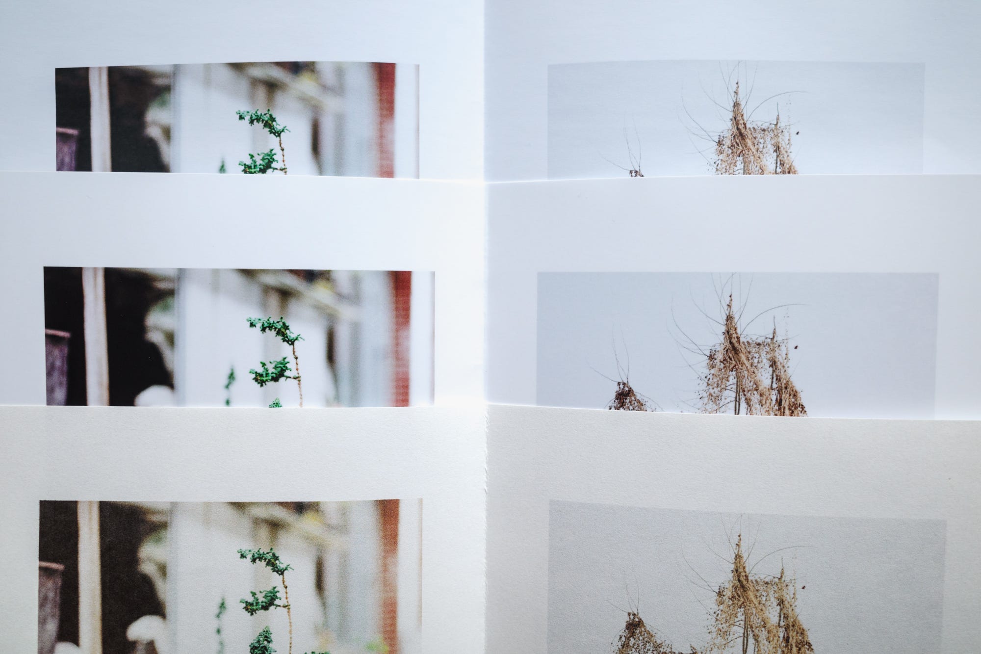
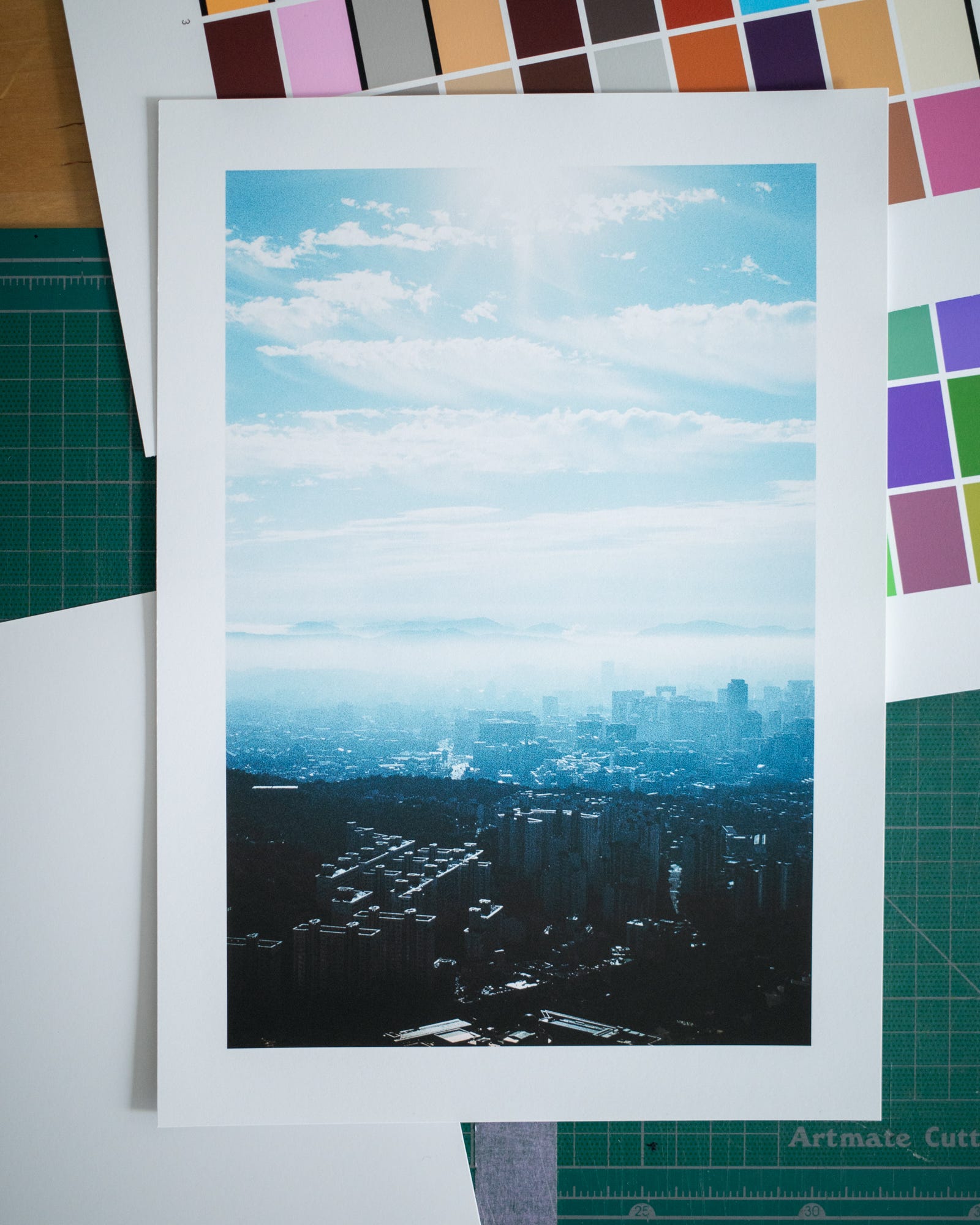
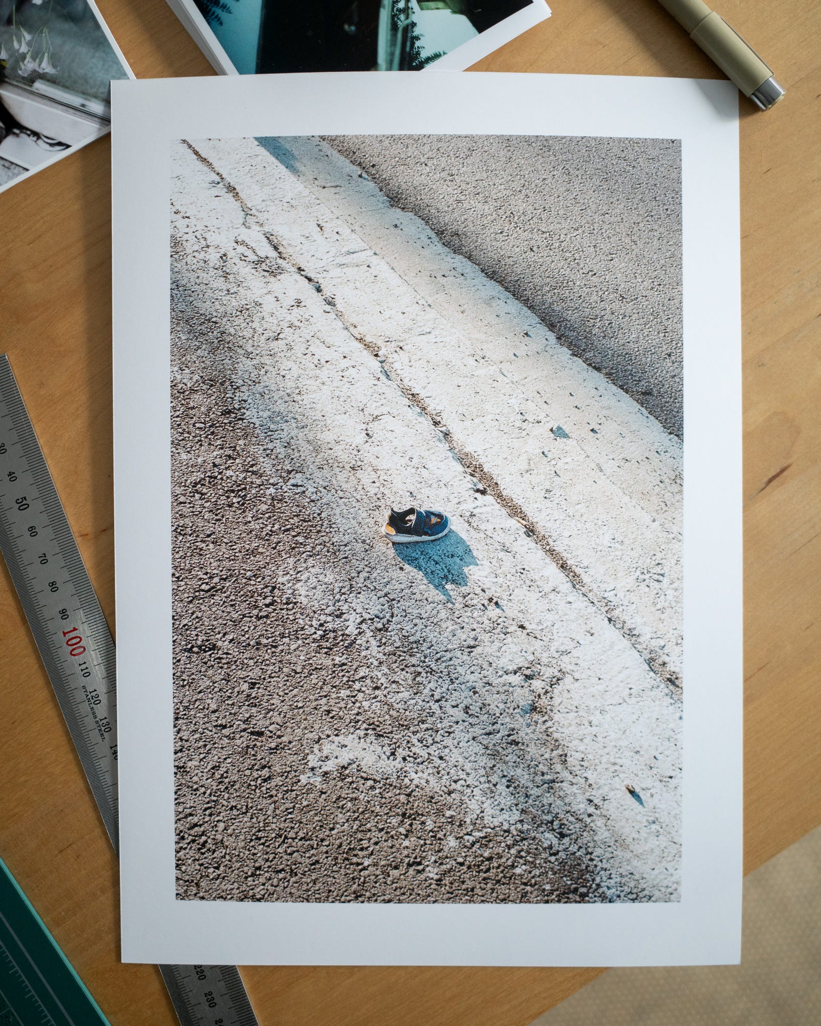
Once your images for print are selected you’ll want to create proof copies. These are the simulations of how the images will look printed. I’ve selected one of my favorite pairs from Serial Music: Vol. 01.

Hit ‘s’ on the keyboard and you’ll enter soft proofing mode. If your newly created profile doesn’t show up, there’s an option to search for it in the folder where it was saved. This is what these images look like soft proofed - my original on the left and the proof copy on the right.


Your task is to make the right image look like the left. My task is to tell you it’s never going to happen. In most cases your white point and black point are going to be less bright and less dark than your original image - it’s simply the limitation of the paper. Fortunately, these limitations seem a bit exaggerated when soft proofing. The true balck and white depth, to my eye, is somewhere in between the proof and the original.
My philosophy behind editing for print is to try and capture the spirit of the original image without ever expecting it to look exactly the same. I’ll not touch the white or black points, but rather by playing with the highlights, shadows and clarity I’ll try to introduce contrast to the tonal midrange. After that, I’ll work on addressing the colour shift introduced by the warmth or coolness of the paper. In this case you can see some of the warmer tone in the sun in the first image and in the shoe’s shadow in the second.
Step 8 - Print
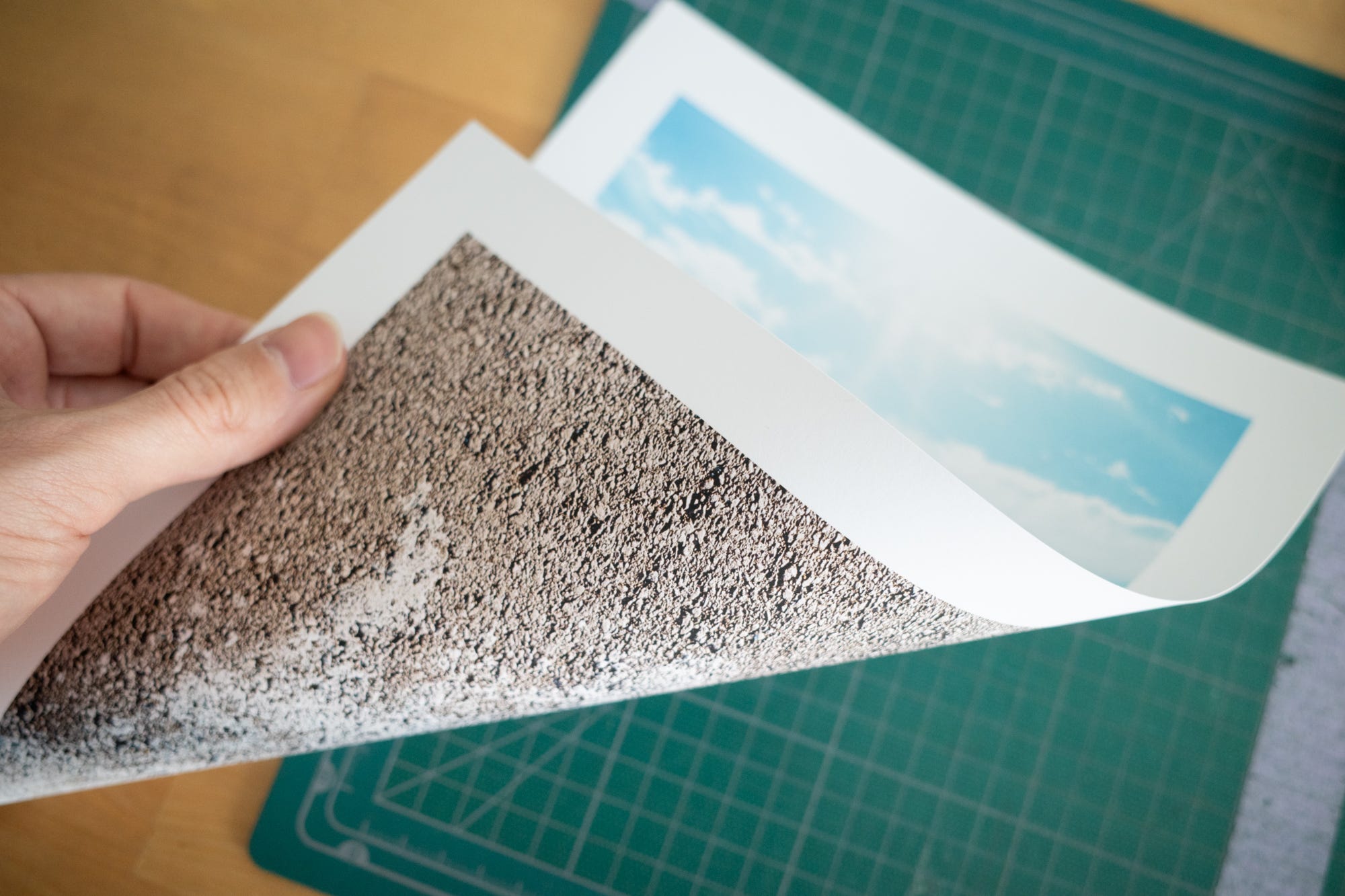
All the prep is done so it’s time to print. Triple check your settings and go for it. Here’s how my images turned out.
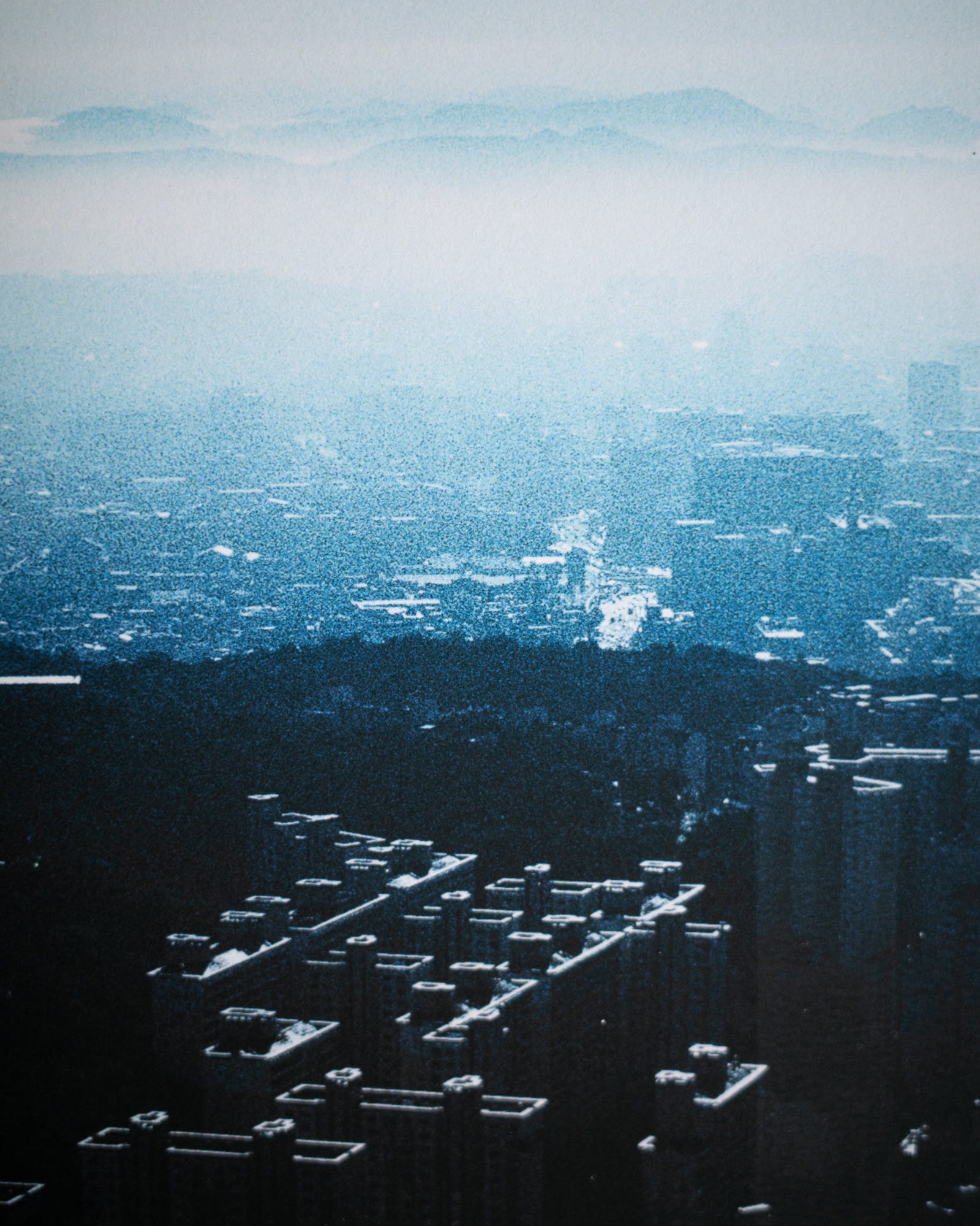
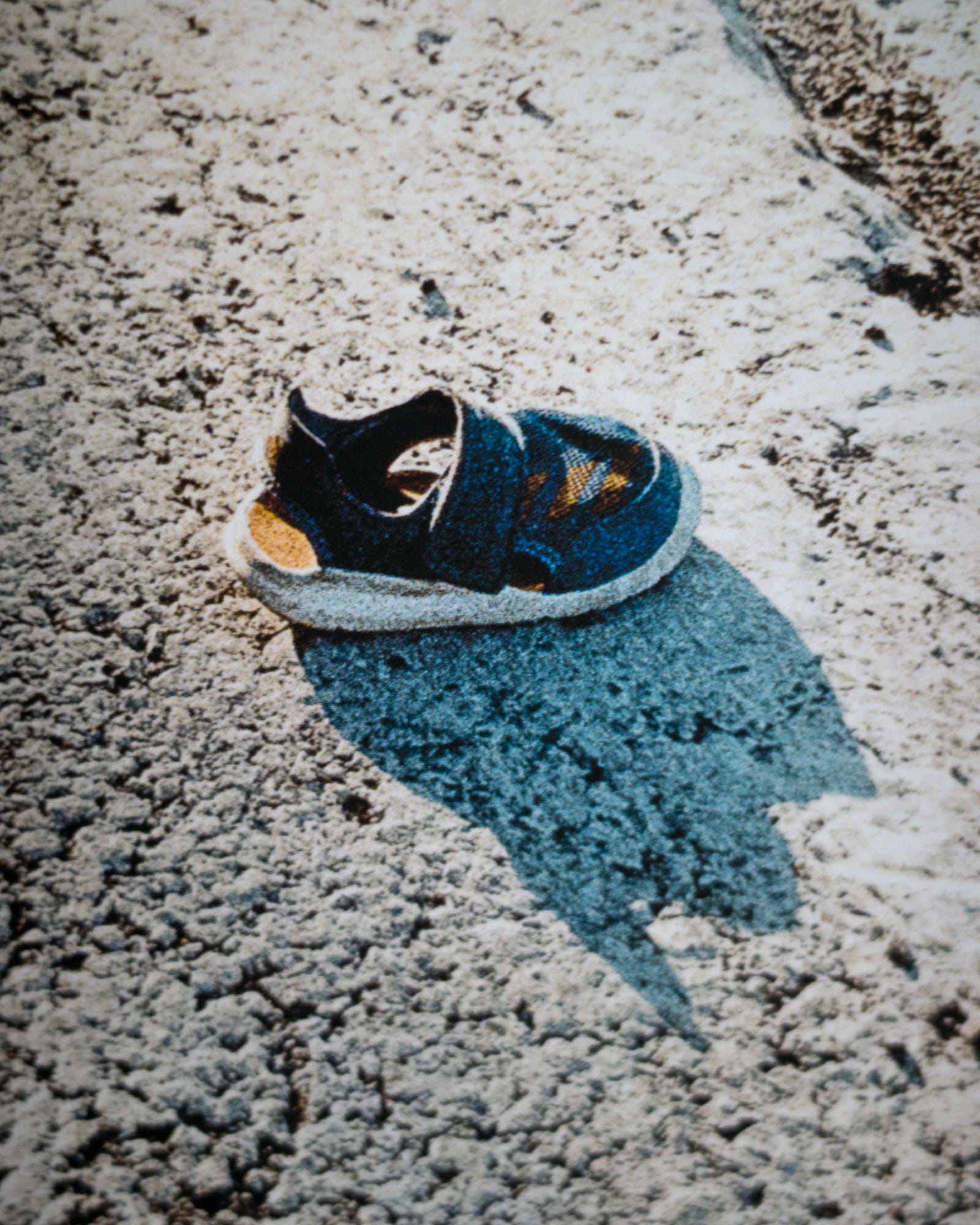
Matte is tough on on darks, but considering the colour rendition, the soft touch to the paper, its general neutrality of tone and its brightness, I’m pretty well satisfied. Also, pretty much all the cheaper papers I tried warped when inked on both sides. The Ilford did a great job of maintaining its shape.
I’ll pick up a box of A4 sheets soon and make a zine dummy out of them. I’ll keep you posted on the results!
Cheers,
Chris.
Very glad I decided against that.
I make the distinction of DIY here because I’m talking about small(ish) prosumer printers. Unfortunately I don’t have quite the set up for Indigo or offset commercial machinery.
Unless it’s a big book.
Me, every time I write one of these things.
Very interesting thanks for this, I’m still to explore printing fully and there’s so much to learn. I’ve never calibrated a screen but I shoot mostly tungsten balanced film (even outside) so I’m always fiddling the while balance in neg lab pro and I never seem to get exactly what I’m looking for - could be the screen
I can absolutely relate to your printing journey! The turnaround time, troubleshooting printing issues, and the overwhelming number of paper options felt incredibly daunting, especially when working with A3+ and smaller formats.
I ate the costs and just bought myself a pro300. For more intricate projects like zines or A2 and larger I revert back to a local printing house however I always experiment in-house first with sample papers and different photo edits.
I'm curious about the software you used for your printing workflow. I noticed own a Canon Pro-500? Have you considered using Canon's professional print and layout software? I found myself wrestling with Lightroom and InDesign (particularly for zine projects), and Canon's dedicated software seemed much less stressful in comparison.
I'm eager to hear more about your zine experiments!